Posts Tagged ‘iPhone app’

Welcome to Boston, Science Teachers! Have a Free DNA App!

Wednesday, April 2nd, 2014

The National Science Teachers Association (NSTA) is having its national meeting in Boston, April 3-6. Around 10,000 science teachers and school administrators are expected to attend. Given that I live a subway ride away from the meeting site, it was a no-brainer for me to take advantage of this opportunity to see what is going on the world of science teaching, to which I feel I belong, but only as a virtual teacher, making apps to teach science. I expect to talk to some of the people that have direct contact with students every day. I’m hoping to get some useful critiques of my apps, as well as making more people aware of them.

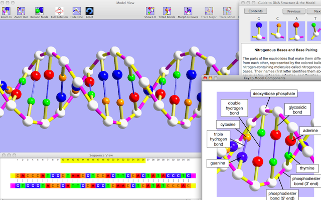
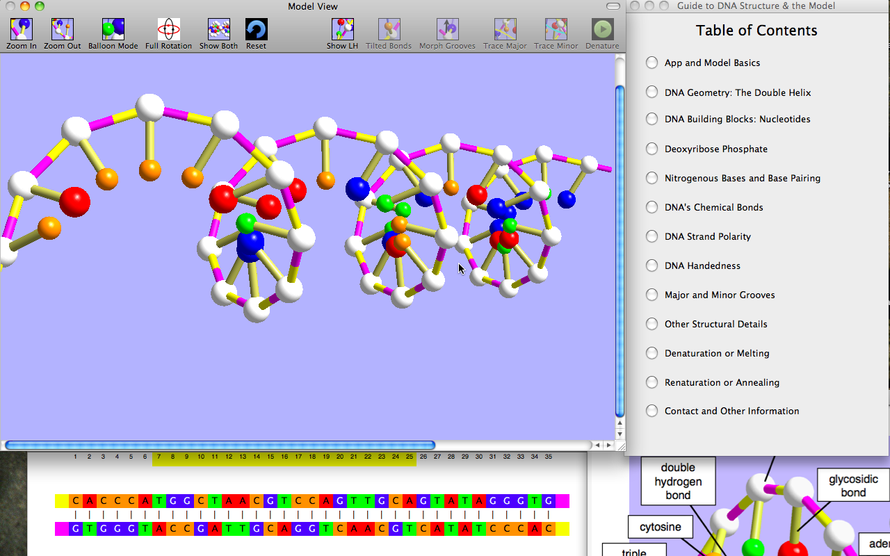
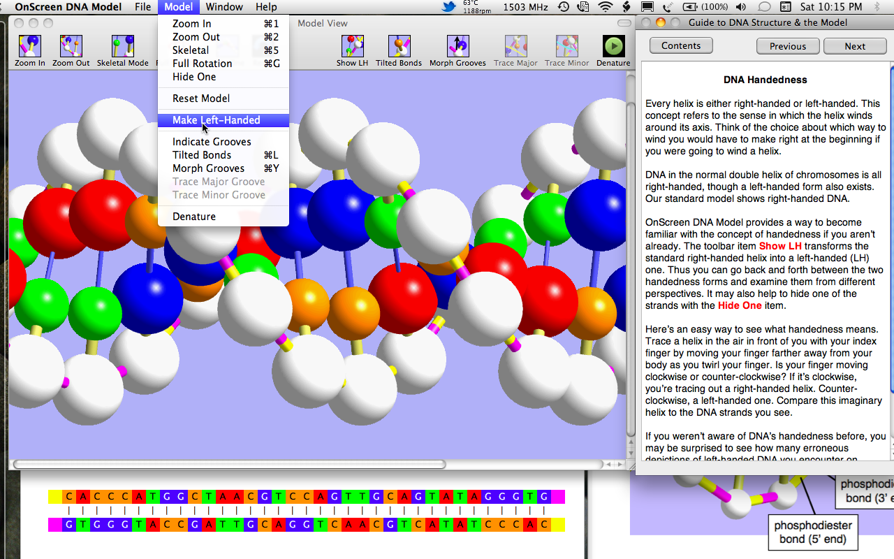
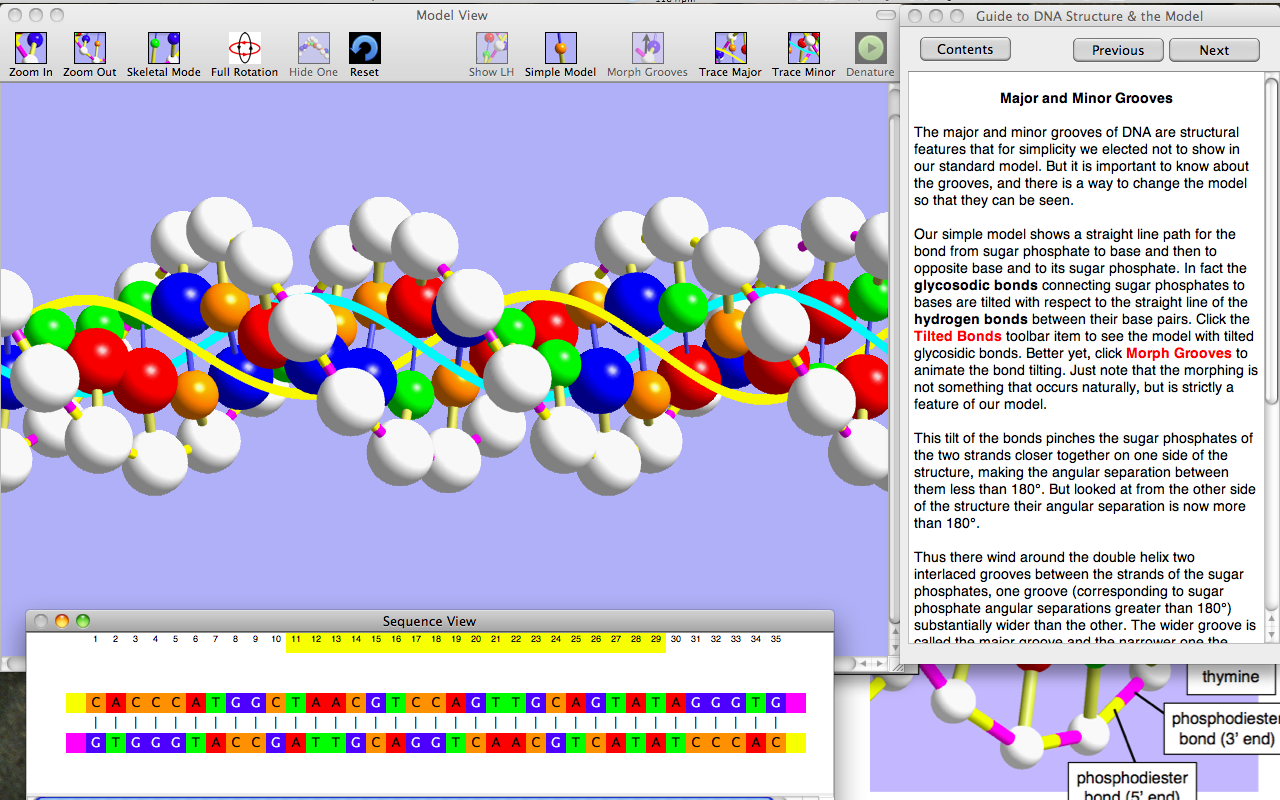
As part of this effort to make more science teachers, especially biology teachers, aware of my suite of interactive DNA apps, I’m making OnScreen DNA Model for iPhone (usually $2.99) free for the duration of the NSTA meeting (through April 6). This app, except for the smaller screen size and consequent shorter DNA strands, is identical to the iPad app OnScreen DNA Model. The other OnScreen Science apps dealing with nucleic acids in the cell are iPad-only. I recently wrote about some good reviews they’ve received, including three for inclusion in the NSTA Recommends online database. Links (App Store buttons) to the other apps can be found in the right sidebar. Of course, OnScreen DNA Model for iPhone is now free to anyone.

Here is the link to the free appOnScreen DNA Model for iPhone.

Enjoy, spread the word, and, if you like the app, please go to the App Store to rate and review it.

dna model

We’re Celebrating DNA Day (April 25) with a One-Day Sale: All DNA Apps Only 99¢!

Wednesday, April 24th, 2013

Sixty years since the double helix structure of DNA was discovered! Ten years since the human genome was mapped!

From the Centers for Disease Control and Prevention (CDC) website: “National DNA Day is a special day when teachers, students, and the public can learn more about genetics and genomics. The National Human Genome Research Institute (NHGRI) at the National Institutes of Health has sponsored DNA Day for the past nine years, to commemorate the completion of the Human Genome Project in April 2003 and of Watson and Crick’s discovery of the double helix structure of DNA.”

To celebrate DNA Day, we are reducing our price on DNA-related apps to 99¢ for the day (with comparable price reductions on app stores for every country). The apps to be priced at 99¢ on April 25 are:

OnScreen DNA Model for iPad
 (regularly $3.99)

OnScreen DNA Replication for iPad (regularly $2.99) 

OnScreen Gene Transcription for iPad
(regularly $2.99) 

OnScreen DNA Model for iPhone (regularly $2.99) 

OnScreen DNA Model for Mac (regularly $2.99)

The OnScreen DNA Model apps (on iPad, iPhone, and Mac) focus on the details of DNA’s double helix structure, using a 3D, color-coded, virtual model that the user can rotate and zoom. Explanatory text deals with the molecules and chemical bonds of the double helix. Animations show two important lab and biotechnology phenomena of DNA: denaturation, in which the strands separate, and renaturation, in which they reunite.

OnScreen DNA Replication
makes use of the same DNA model to show how, through the action of specific enzymes, a DNA molecule is perfectly duplicated before cell division. The various steps in the process, including the action of telomerase to prevent strand shortening, are shown in 3D animations and described in some detail.

OnScreen Gene Transcription makes use of the same DNA model to show how a genetic recipe stored in the sequence of molecules of DNA is copied by construction of a messenger RNA molecule. The various steps in the process, shown in 3D animations that make it clear that messenger RNA is constructed as part of a hybrid RNA/DNA double helix, not a 2D ladder, are described in some detail, emphasizing the role of certain enzymes.

The apps show details of structure and processes that are sometimes depicted in erroneous ways in places that should know better. Animations make the processes memorable. Discussion of the chemistry involved is at an introductory level, so the apps are useful for learning about DNA to a wide range of students or anyone interested in the science of Life. There really is nothing comparable on the internet.

For iPad users, DNA Day is a chance to get all three OnScreen Science’s DNA apps for less than the regular price of OnScreen DNA Model alone. The apps work great and look great on an iPad Mini.

Educational purchasers enrolled in Apple’s Volume Purchase Program still get 50% off the sale price when buying twenty or more copies at a time.

Spread the word. This is a one-day-only sale.

We’re Celebrating DNA Day (April 20) with a One-Day Sale: All DNA Apps Only 99¢!

Friday, April 20th, 2012

From the National Humane Genome Research Institute website: “DNA Day is a unique day when students, teachers and the public can learn more about genetics and genomics! The day commemorates the completion of the Human Genome Project in April 2003, and the discovery of DNA’s double helix. This year, NHGRI will celebrate National DNA Day on April 20, 2012.”

We are reducing our price on DNA-related apps to 99¢ for the day. The apps to be priced at 99¢ on April 20 are:

OnScreen DNA Model for iPad (regularly $3.99)

OnScreen Gene Transcription for iPad (regularly $3.99)


OnScreen DNA Model for iPhone
(regularly $2.99) 

OnScreen DNA Model on the Mac App Store (regularly $3.99)

The OnScreen DNA Model apps focus on the details of DNA’s double helix structure, using a 3D, color-coded, virtual model that the user can rotate and zoom. Explanatory text deals with the molecules and chemical bonds of the double helix. Animations show two important lab phenomena of DNA: denaturation, in which the strands separate, and renaturation, in which they reunite.

OnScreen Gene Transcription makes use of the same DNA model to show how a genetic recipe stored in the sequence of molecules of DNA is copied by construction of a messenger RNA molecule. The various steps in the process, shown in animations, are described in some detail, emphasizing the role of certain enzymes.

The apps show details of structure and process that are sometimes depicted in erroneous ways in places that should know better. Discussion of the chemistry involved is at an introductory level, so the apps are useful for learning about DNA to a wide range of students or anyone interested in the science of Life.

Coming Soon to the Big Screen—OnScreen Pitch Count for iPad!

Saturday, July 2nd, 2011

I am happy to announce that OnScreen Pitch Count, my app for recording, calculating, and reviewing pitch results and stats of baseball and softball games will be available in a new version for the iPad on the iTunes App Store very soon. Barring the last minute discovery of a bug, which I don’t expect at this point, I’ll be submitting it for review in the next couple of days. For news and more information about OnScreen Pitch Count and other apps from OnScreen Science, Inc., see the web site nondummies.com or follow me (@onscrn) on Twitter.

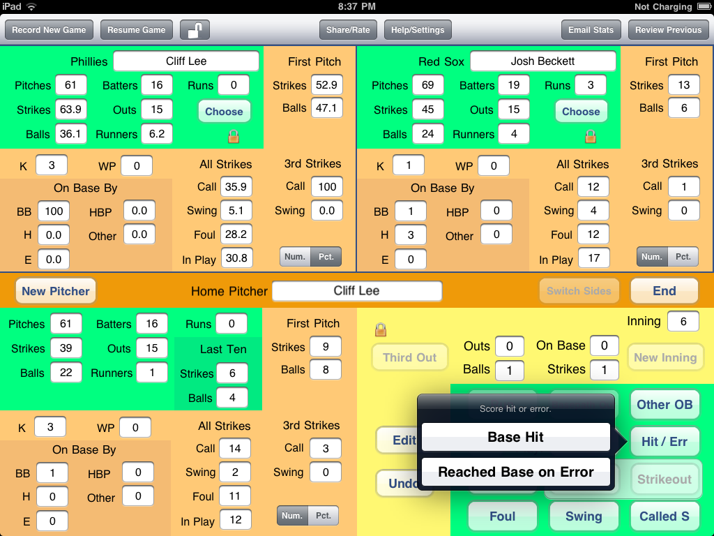
I think I’ll just show one screen shot from the new app now, since I’ll probably want to make another short blog post when it’s really on sale, and I can show more then. The one below was taken from a game I was recording to test the app. Cliff Lee of the Philadelphia Phillies had just had his no hitter broken up by the leadoff batter in the sixth inning, as you’ll be able to see if you look closely at the stats. Well, they may be too small to see there, but you’ll have no problem reading them full-size on the iPad. The hit is about to be registered. The general layout of the screen is described in some detail below.
ipad pitch count

As a further preview, here is the description of the app as it will appear on the App Store (subject to modification):

OnScreen Pitch Count, the most highly regarded pitch stat app for the iPhone, has come to the big screen! Designed by a baseball/softball coach who knows what coaches and fans need to know about pitch results, OnScreen Pitch Count stands out among pitch count apps.

Increase your enjoyment of ball games by giving more attention to the details in a way that’s not burdensome. OnScreen Pitch Count is just the right medium between barebones pitch counters and extremely detailed apps.

With the big screen of the iPad you can see lots of stats at the same time, even as you record pitch results. And you can transfer the results you’ve already recorded on the iPhone to the iPad just by emailing the app file as an attachment, as the files are compatible between the two versions.

OnScreen Pitch Count allows you to keep the running totals of

• kinds of strikes: foul, swinging, called, ball put in play
• third strikes: swinging, called
• balls
• total pitches
• first pitch strikes and balls
• strikes and balls in the last ten pitches
• batters faced
• outs recorded
• strikeouts
• base runners
• how many runners reached base by: walks, hits, errors, hit by pitch, other
• runs allowed
• wild pitches

just by tapping easily learned buttons on the screen.

If your interest is in one particular pitcher, you can just follow that one. If you want a complete record of pitch results for every pitcher in the game on both teams, you can track them. There is no limit to the number of pitchers you can record in a game, and OnScreen Pitch Count properly charges runs to pitchers who allow base runners but leave the game before the runners score.

As you record pitch results, you see the cumulative stats of the pitcher updated immediately on the screen. Display total numbers as well as percentages at the same time. Compare the current pitcher’s numbers with the opposing pitcher’s. The stats are on the screen to see. While recording a game you can see the stats for up to three pitchers at a time. When reviewing previously recorded games, you can see four at once. Or compare totals and percentages side by side.

As you record pitches you also see the count on the batter and the number of outs and baserunners, so you never lose track of what the situation is.

Did you tap the Ball button, only to hear the umpire call the pitch a strike? No problem. Tap the Undo button to take the ball away. Tap the Strike button to correct the count. The results of up to two consecutive pitches can be undone. In case you’ve somehow lost track through a distraction, you can edit the count on the batter, outs in the inning, or number of base runners, though the undo feature should be used when possible.

What if you record a strikeout for the third out, only to see the catcher drop the ball and the runner reach base safely? No need for the Undo button. Tap the button for batters reaching base by ways other than putting the ball in play; select the case for reaching base after a strikeout; and the out is then removed, while the strikeout remains tallied, and the number of base runners increases by one.

After you’ve finished with a game, which can be as soon as the pitcher you’re interested in has finished, the results are automatically stored on your iPad for later review, and you can email the results of a single pitcher or all those on the team. Email just a text summary of the results or attach a csv file that you can import to a spreadsheet. AND, if you know someone else with this app—either the iPad or the iPhone version—email them the actual file you’ve recorded for them to view with the app on their device. Or email the file to yourself as a backup.

OnScreen Pitch Count has been available for the iPhone and iPod Touch since August of 2009, and of course that version can be used on an iPad, but only in a sort of little iPhone window on the iPad screen or blown up with pixel doubling, which simply magnifies the iPhone image, while making it look worse. Running the iPhone version of OnScreen Pitch Count on an iPad does not free the app from the iPhone’s limitations, most notably its small screen. The iPhone’s small screen is just the price one pays for its great portability and convenience.

I was gratified and relieved to see that as spring and a new season for baseball and softball in the USA arrived earlier this year, sales of OnScreen Pitch Count ramped up nicely and were running well above the previous year’s level. This indicated that there was an ongoing need for the app and that a fair number of people were taking the trouble to actively search for pitch count apps and then to splurge on a $3.99 app based on the app description, screen shots, and high customer ratings they could see on the app store. It would be interesting to know how many of those who download OnScreen Pitch Count do so after disappointment with a cheaper competing app. My guess is quite a few, so that in a way the higher price of OnScreen Pitch Count compared to its competitors may actually be giving them more sales, as people decide to “risk” 99¢ first.

OnScreen Pitch Count, while not making enough money to brag about, has been a hit, in terms of user enthusiasm. This is evident in the user reviews, which abound in exclamation marks and high praise, and in the emails I’ve received. Some of the reviews are so glowing (“The best app I have ever bought!!!!”) that I worry that they’ll be seen as bogus, but they are 100% real reviews. Well, there was one negative review that I’m 99.99% certain was actually meant for a competing app, since the specifics of the comments clearly applied to the other app and not at all to OnScreen Pitch Count. That one hurt sales for a while and probably cost me a couple of hundred bucks. I plan to write about app developers’ susceptibility to harmful, uninformed reviews sometime. Anyway, despite having sold something less than 1,000 copies of the app, I feel very satisfied to know I’ve conceived and created an app that a good number of people have found very useful, even delightful. Would that there were a way to get the word out to the many other parents, coaches, and fans who might also love it if they only knew about it!

Sometime back in March I decided that my next app development project should be bringing OnScreeen Pitch Count to the iPad. I hoped that I could have the iPad version finished sometime in May so that it wouldn’t entirely miss the peak time for baseball and softball, which means Little League and high school seasons. That time constraint for peak sales potential was really the determining factor in my decision to work on this app next. I hadn’t thought through exactly how I would take advantage of the greater screen area of the iPad, but I knew it would be possible to eliminate a lot of switching from one view to another as compared with the iPhone version.

As is usually the case, the job took longer than I’d hoped. Back when I first started app development I had also originally meant to get OnScreen Pitch Count for the iPhone ready for a spring debut, and had barely gotten it on the App Store while it was still August, so there has been improvement!

I had already developed an iPad app (OnScreen DNA Model) but in that effort I had been able to avoid one complication that I’d have to deal with for OnScreen Pitch Count—the need to make the app completely usable whichever way the user wanted to orient the device. Apple reviewers are pretty insistent on this unless you have a good reason not to, which I was able to argue for in the case of the DNA model. For an app with numerous user interface elements and data displays in various views on the screen, this is not a trivial task. I guess it probably added a month to the development time. Knowing what I now know, of course, I could do the same thing again (and with better code design) in a much shorter time. Every app developed makes it that much easier to develop the next.

The main question to address was how was I going to use all that extra screen space to enhance the app? I wanted to use as much of the iPhone app’s code as I could and also make the iPad app seem immediately familiar to anyone that already had the iPhone version. One of the difficulties in adding a new type of pitch data to the iPhone version is the lack of space on the screen to present it. I’ve had users request the ability to record and see first pitch strikes and balls and the number of strikes in the last ten pitches, for example. There was room for these and more on the iPad screen, so I couldn’t use the lack of space excuse on the iPad and have indeed coded the iPad app to keep track of these numbers. The users of OnScreen Pitch Count for iPhone can expect to see these features incorporated in an update before long. I’ll come up with a way to show the new data, even if it’s not a pretty way.

I played around with a number of ideas on how to use the extra screen area of the iPad but eventually decided that the default (and currently, only) use should be to display pitch result data for the different pitchers in the game. All those results are available for viewing with the iPhone version, but the user has to swap out the pitch recording screen in order to see the complete pitch results, and still the results can be seen for only one pitcher at a time, even for completed games being reviewed.

The bottom right panel of the iPad contains the buttons for recording pitch results and a display of the current situation: count on batter, runners on base, and outs. The lower left panel shows the cumulative pitch totals in various categories for the pitcher currently on the mound. These are updated after every pitch. The default layout is then to have the same data displayed in the upper left panel (also kept current), only in the relevant percentages that go with the numerical totals show below it The upper right panel displays the totals for the pitcher on the opposing team, if that team’s pitches are being recorded. If there are more pitchers, or if the user wants to display percentages for a pitcher other than the default, he or she can make that choice. So there are three panels available for showing pitch totals while a game is being recorded with the lower left panel always showing the current pitcher. For reviewing completed games, all four panels are available for displaying pitch results at the user’s choice, both in terms of which pitcher and whether totals or percentages.

The last major upgrade feature added to OnScreen Pitch Count for iPhone was the ability to send as email attachments files containing the recorded pitch data in a format that anyone with the app could read and display on their own device. In addition to file sharing this feature provided a way to back up files on any computer. Of course, I wanted to make it possible for users of both the iPad and iPhone versions to share each other’s app files as well, and this turned out not to be that difficult. So anyone with games recorded on the iPhone version can email them to the iPad for viewing the data of up to four pitchers at once.

I’m really glad to have the basic coding of this app behind me and can’t wait to see how people with iPads like it. As always, I invite anyone with a problem, question, or suggestion to email apinfo@onscreen-sci.com.

Maybe I’ll take a break from coding long enough to write something for this blog, or should I say blog archive, since that’s all it’s amounted to for the past several months?
Taking OnScreen DNA Model to the Mac App Store

Thursday, February 10th, 2011

I’m happy to say that OnScreen DNA Model for Mac, barring an unexpected delay by Apple’s gatekeepers (it’s been waiting for review for a week), will soon be available on the Mac App Store. Check out nondummies.com for news. I’ll intersperse a few screen shots from the app below as a preview of things to come. While I’ve read of some independent Mac developers worrying about what the advent of the Mac App Store might mean for their sales and profits, I am almost certain it will be beneficial for the OnScreen Science, Inc. apps.

macapp

The Mac App Store (limited to Macs running at least OS 10.6.6) provides a virtual shopping center for Mac users wanting to purchase software to run on their Macs or just to browse through the selections—conveniently categorized—for future reference, much as the iTunes App Store has been doing for iPhone and iPad users for quite some time.

Of course Apple keeps 30% of each sale for itself, but in addition to the great drawing power of an Apple-run app store, it’s providing a lot more for that. Start with buyer confidence. If an app is for sale on an Apple-run app store, Apple has at least verified that it is not obviously buggy nor, in the reviewer’s judgment, totally worthless. Furthermore, buying the app is very simple, as the buyer’s credit card info is already in Apple’s (presumably secure) possession, and installation of the app on the user’s computer is automatic and immediate. And the procedure will already be familiar to many users from earlier experience with iTunes and its App Store.

Each app approved for sale on the app store is given a chance to present its best face through the developer’s own description and up to five screen shots (chosen by the developer), showing the app’s features. I should add that the feature page for the app can also serve to give users clues as to which apps are likely “crap apps.” Personally, I’m always a little suspicious of apps with only one or two screen shots.

Apps not only appear (with name and icon) in the array of apps displayed by category but can be found via keyword search. This search feature is crucial for niche apps such as those sold by OnScreen Science, Inc. because after a few days an app that’s not a big seller tends to become practically invisible to all but the most dedicated browsers, as the app moves farther down the list ordered by release date. The big sellers remain visible by virtue of their sales prednisone in a separate list devoted to the most popular apps.

Now, for games, the importance of being on the list of popular apps is obvious, and this is what has driven the “race to the bottom” for app prices, as the presence of high quality games selling for 99¢ can make an app, even a “serious” one in a very different category, seem outrageously expensive at $4.99 in some minds. I think there’s also something about the ratio of the price of the app to that of the device it runs on (and screen size) that makes app prices so low for apps on the iTunes App Store. But in the final analysis it’s really the ability of some developers to make a lot of money selling apps at a low price, thanks to the enormous number of potential customers, all funneled to a single buying point, that keeps prices low. That and the “free” apps, which I may write something about at a later time.

Let me say a little about the “desktop” OnScreen DNA apps from which the OnScreen DNA Model apps spring. OnScreen DNA, sold in three flavors—Lite, Standard, and Pro—has been available for Mac and Windows computers for several years. All these apps, especially aimed at biology teachers for use with students or for classroom demonstrations, are presented in a tutorial format that guides users through activities, complete with animations, designed to teach the structure and function of DNA.

Anyone that already has OnScreen DNA Lite will not be getting anything essentially new by buying OnScreen DNA Model on the Mac App Store. Rotating the model with the mouse is easier in the new app, as it is done with mouse drags requiring no key to be depressed. Some might prefer the new presentation of DNA facts to the old tutorial method. But as far as the basic model and the two simulations go, nothing much has changed.

single

The Lite version deals mainly with the structure of DNA, though it includes simulations of denaturation and renaturation. OnScreen DNA (without the “Lite” qualifier) adds simulations of gene transcription and DNA replication with a good deal of detail about the enzymes involved and an accurate depiction of the basic steps (hydrogen bond breaking, strand unwinding, nucleotide chain forming, etc.), including proper direction of chain-building, primer RNA and Okazaki fragment construction, and even the role of telomerase in solving the “end problem” of DNA replication.The Pro version adds simulations in which the user, not limited to observing processes unfold, tests his or her knowledge by actively selecting the proper enzymes at the proper time and choosing the next nucleoside to add to a growing polymer chain. I should add that these apps, being designed mainly for teachers, include interactive tests, the results of which can be stored on the computer (under password protection if desired). More details about these apps, which are still unique and still for sale, can be found at onscreen-dna.com.

The aforementioned web site has been (and is still at the time I write) the only place to buy these apps. Thus sales have largely been limited to the hardy Googler that seeks DNA teaching software, or is at least searching for detailed information about DNA. No one with just a vague interest in science and biology is likely to stumble upon the web site. The price for advertising in even a relatively small circulation magazine for science teachers is really too high to justify from the sales it would likely produce, based on past experience. Though a ninety-day, no-questions-asked, satisfaction guaranteed policy for complete refund is in effect for our apps, I’m sure many people are hesitant to buy from an unknown online source. Thus the Apple seal of approval could be extremely valuable.

dnamenu

After the iPad was announced, I came to see it as a opportunity to bring some of the OnScreen DNA software to a larger audience (using the existing code for displaying the three-dimensional DNA images on the iPad). I knew from experience with “DNA Day” sales for which I announced large discounts for a short period via a few Mac news sites that there were people who were not teachers that might be interested in a way to learn more about DNA for a price that wasn’t too high.

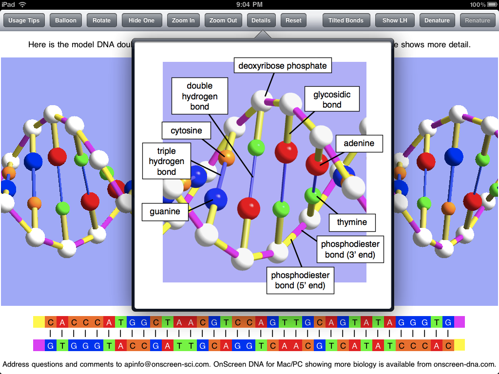
By far the easiest path seemed to be to start with a port of OnScreen DNA Lite to the iPad. Partly from screen space considerations I decided to scrap the tutorial format. I refer the interested reader to an earlier blog post The Thinking Behind the OnScreen DNA Lite™ iPad App for more about the iPad app. In some ways I felt the iPad app to be better than the Mac/Win versions just because of the direct response to the fingers, unmediated by a mouse. But, due to limitations of the somewhat stripped down version of Open GL (graphics programming API) available on the iPad, some features were lost, such as the ability to ctrl-click on any component of the DNA model to see it labeled. Of course ctrl-click has no meaning for the iPad anyway. In place of the labeling feature I added a popover image with a key showing how all the different parts alprazolam were represented in the model.

The iPad app was launched with the old name OnScreen DNA Lite, which didn’t make all that much sense in the iPad context. This was rectified by the new and current name OnScreen DNA Model, which is more descriptive and avoids the implication that there is a more advanced version of the app available for the iPad. At the same time as the name change, the app gained a significant enhancement with an on-screen (popover on iPad) guide to facts about DNA’s geometry, molecular components, and chemical bonds and how they are displayed in the model. The blog post OnScreen DNA Model for iPad and iPhone: New Name, More DNA Background illustrates the changes. Oh yes, as the title of that post indicates, a version for the iPhone and iPod Touch is also available.

grooves

When the Mac App Store was announced, I had no doubt that I would want to bring the OnScreen Science, Inc. science education apps (OnScreen DNA and OnScreen Particle Physics) to it. It took a bit of thought to decide what to do first, but based on the relative success on OnScreen DNA Model on the iPad (sales have continued to rise, contrary to the usual fate of apps on the iTunes App Store), I decided to get a version of OnScreen DNA Model ready for the Mac App Store.

This was a decision to make the Mac version very similar to the iPad version, rather than a small modification of the existing OnScreen DNA Lite. Thus the tutorial and the division into activities are not found in the Mac App Store version of OnScreen DNA Model. I think this is a net improvement due to the greater freedom it gives the user, even at the risk of some important points possibly being missed and without the potential benefit of a guided discovery that aims to get the user thinking.

To a certain extent, how successful the new app is on the Mac App Store will determine how quickly I move to bring the simulations of OnScreen DNA to the store. There are a number of decisions, really, about what to attempt in the way of simulated DNA processes for the iPad version and whether to work on the iPad or the Mac version first. It may make more sense to get OnScreen Particle Physics (onscreen-sci.com), our classic particle detection chamber simulation, onto either or both App Stores first.

Time will tell https://www.capefearcardiology.com/clomid-over-the-counter/ whether I’m being too optimistic, but I’m really encouraged by the opportunity the Mac App Store is giving me and other independent developers to get our apps before a lot of new eyes and minds.

OnScreen DNA Model for iPad and iPhone: New Name, More DNA Background

Tuesday, September 28th, 2010

I’m pleased to say that OnScreen Science has a new iPad app on the iTunes App Store—OnScreen DNA Model 2.0—with another app—OnScreen DNA Model for iPhone 2.0—awaiting review and hopefully available in a matter of days. Actually, they are major updates of apps previously called OnScreen DNA Lite and are free to anyone who purchased either of those apps.

The main change to the two apps is the addition of accessible background material on DNA and explanations of how different features of DNA structure are represented in the virtual DNA model in a memorable, instructive way. For example, there are now discussions of DNA strand polarity—what it means and how it is represented in the model—and the major and minor grooves of the DNA double helix—what they are, their physical origin, and how to make them appear in the model. This new material makes the apps more self-contained than before, although they are still not meant to be a sole source for learning about DNA structure. The point is made that the model represents certain molecular components of DNA, not atoms.

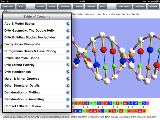
The new klonopin material is found in a popover view in the iPad version of OnScreen DNA Model. The popover view appears at the tap of a new button called “Useful Stuff”. The image below shows the interactive table of contents listing the various topics dealt with. The user only has to tap on a disclosure button (blue arrow) to see a discussion of the corresponding feature and how it is modeled in the app.

contents

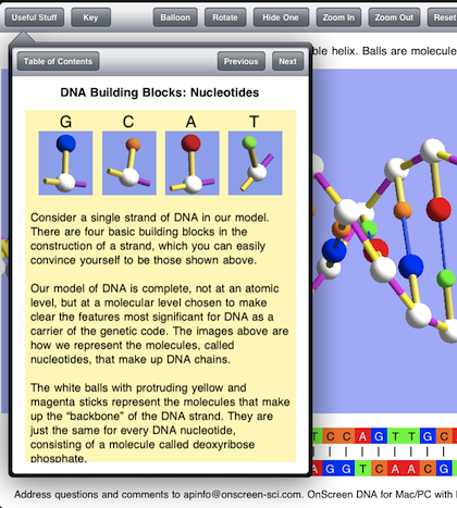
Below is shown the Nucleotides item, or rather the beginning of it since there is more text to be read after scrolling down in the app.

nucleotide discussion

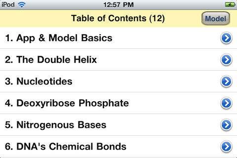
Because of the smaller screen size the iPhone app cannot display the full table of contents on a screen, but all items can be seen and accessed by scrolling. The content of the various items are the same in iPad and iPhone versions of OnScreen DNA Model. Below is the top of the table of contents in the iPhone app.

iphone contents

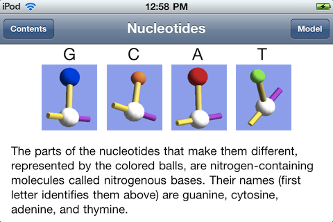
Seen below is the Nucleotides item from the topic list. Less text is visible at a time in the iPhone version, but everything in the iPad version is accessible by scrolling. The text shown below is what would be seen in the iPad version after scrolling down from the point shown in the iPad example above.

iphone item

Why the name change? OnScreen DNA Lite implies there is a “full” or standard version, but there isn’t. “Lite” also gives the idea of limitations, perhaps severe limitations. The name just sort of snuck over from the desktop software, where there are Lite, Standard, and Pro versions of OnScreen DNA. Each higher version adds something to the version at the level below it, and there is a policy of letting customers apply the price they’ve already paid to the price of the higher level version whenever they want to retin-a upgrade. That is not possible for an app, given the way the iTunes App Store is set up.

The plan is to bring some of the simulations of DNA processes to the iPad (less likely to the iPhone with its smaller screen) in the future, but the names of those apps will more directly reflect what they simulate.

In any case, OnScreen DNA Model perfectly fits the app, which consists of a virtual 3D model designed to make essential features of DNA readily apparent. It is a superior model that stands on its own and shouldn’t have a name https://personalsolutionsinc.org/ativan-lorazepam/ that could diminish it in the mind of anyone first encountering it.

While the name and the extended background guide are new, the basics of the model remain the same as presented in earlier blog posts: OnScreen DNA Lite™ for iPhone Now Available, An OnScreen DNA Lite™ for iPad Gallery, and The Thinking Behind the OnScreen DNA Lite™ iPad App. See the iTunes App Store descriptions of OnScreen DNA Model and OnScreen DNA Model for iPhone and iPod Touch too of course.

iPhone App Update Roundup

Wednesday, August 11th, 2010

I’ve gotten three of the OnScreen Science, Inc. iPhone apps reworked for iOS 4 and the new iPhone 4. Two of them—OnScreen Pitch Count 1.5 and OnScreen GPA Pro 1.2—have been approved and are now on sale. OnScreen DNA Lite for iPhone 1.1 is still in the queue for review. If things proceed as for the other two (week of waiting, a few hours in review), then the update of the third app should be on sale August 12 or 13. The update of the fourth app, OnScreen QB Stats, involved more than just making it work and look good under the new system and on the high-definition “Retina” screen of the new iPhone. I wanted to give it the same improved user interface and navigation among games and players that OnScreen Pitch Count had recently received, so it is taking a little longer. Given that football season is still a ways off, OnScreen QB Stats was a lower priority. Assuming the rest of testing and debugging is not prolonged, that update should be on sale by around August 20.

One of the nifty new features of iOS 4 on later generation iPhones and iPod Touches is multitasking. Whether or not it’s “true multitasking,” Apple’s implementation of the feature allows for keeping an app in memory when a new app is chosen to run on the same device, and then later to quickly switch back to the original app without having to load it again. Since the OnScreen Science apps had been programmed to remember where they had been whenever the user jumped to another app, so that they could resume right where they left off upon relaunch, the only difference with multitasking will be in the speed of resumption, but a second or two is a second or two.

The other essential part of updating for the latest iPhone is to make sure the screen displays of the app look good on the Retina screen. That means a developer has to produce and include higher resolution versions of any images and icons that the app displays. New screen shots for the iTunes App Store display of the app also have to be submitted. These were straightforward but somewhat tedious tasks. There weren’t many such images, so I had it easy compared to some people.

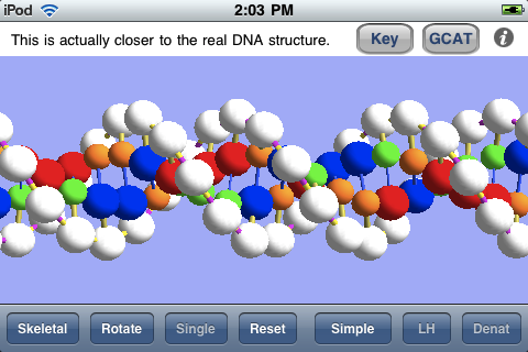
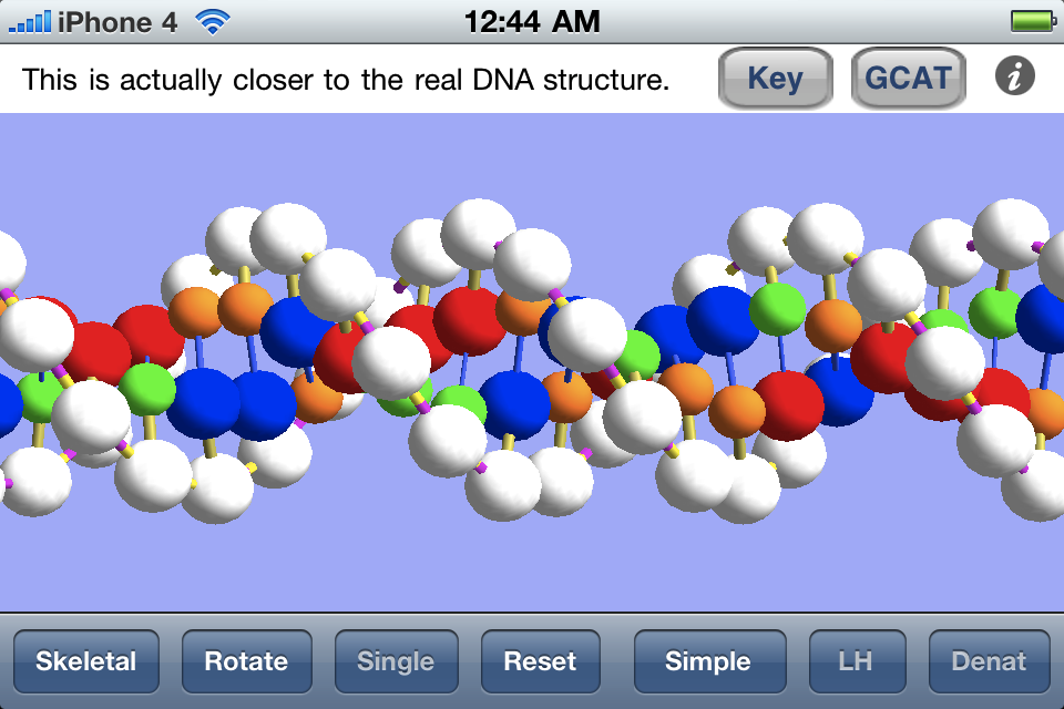
The one app I was worried about providing a nice iPhone 4 version for was OnScreen DNA Lite for iPhone. The virtual DNA model is drawn in 3D using the iOS implementation of OpenGL ES. The drawing assumes a certain pixel density, which is way off for the Retina display of the iPhone 4 which has a higher pixel density. Images drawn with the unmodified OpenGL code are displayed on the Retina screen just by blowing them up, so that they actually look worse—much more jagged—than they did on the old iPhone. It took me a while to figure it out, but the solution was very simple. I only needed to put in a test for what device the app was running on, and in case it was iPhone 4 make a change to one line of the old code (doubling the dimensions of glViewport for the iPhone 4) and add a call to scale the image by a factor of 2. I couldn’t believe my luck when I tried just that and saw it was all my code needed. Not only does the iPhone 4 version look better than the old version did on the iPhone 4, it looks better than the old version did on the old iPhone, since it takes advantage of the higher definition screen (extra pixels) during the image rendering. This can be seen in the comparison below.

old dna image

Above is a screen shot from the original iPhone running OnScreen DNA Lite for iPhone.

iphone4 dna image

Above is a screen shot from an iPhone 4 running OnScreen DNA Lite for iPhone.

There was another update to OnScreen Pitch Count before the latest version 1.5. A user had encountered the problem of not being able to view the pitching stats for the last couple of pitchers when he’d kept track of pitches for numerous pitchers on both teams. This turned out to be a bug I’d introduced in version 1.4 when I failed to take into account a change in view dimensions made necessary by the addtion of a toolbar at the top of the screen. The user called me to point out the bug, and I was grateful for that. I had a fix submitted in a day or two. I had already been working on the iOS 4 upgrade, but felt I needed to get the bug fix online as soon as possible without waiting for completion of the other changes, which is why 1.5 followed 1.4.1 so closely.

OnScreen Pitch Count Update 1.4 Now on iTunes App Store

Monday, June 14th, 2010

A new version of OnScreen Pitch Count, the most complete, easy-to-use app for recording baseball pitch results on the iPhone and iPod Touch, is now available. Getting OnScreen Pitch Count to the point where it did its main job well and reliably in a way that was quickly learned was my top priority, and I think I was successful in that right from the first release. With time I’ve been able to add features such as emailing results, including attachments that can be imported into spreadsheets. This new update is more in the nature of a polishing than one that introduces big changes. I’ll just use a few screen shots as the quickest way to point out the differences from earlier versions. I recommend downloading the new User Guide for more complete details.

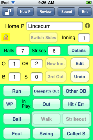
An obvious difference to anyone that’s used the app before is the presence of a toolbar at the top of the different screens of the app. The main screen in which pitch data is entered is shown below. The four toolbar buttons with titles, none of which are used for recording pitch results, were formerly elsewhere on the screen and just do what they always have. The totally new control is the one with the opened lock icon on the left of the bar. A bit below it, in the top yellow region, is a closed lock, which indicates that the screen is locked, its normal condition. As one might expect, tapping the button unlocks the screen and changes the icon indicating the lock state to show an open lock. So what does unlocking do? Two things really. First, it makes it possible to edit the pitcher’s name. Previously, once the name had been entered and saved it couldn’t be changed. Obviously, there are times you might want to change the name, including of course when you’ve misspelled the name for some reason, but also when you’ve only learned the pitcher’s name sometime after the game started, or even after it ended. Unlocking allows you to change the pitcher’s name both during the course of the game or later when you’re reviewing it.

The other thing unlocking does is to make it possible to terminate an inning before three outs have been recorded. This is something that comes up in leagues with limits on runs scored or total batters in an inning. Having coached in a minor Little League that only allowed a team to bat once through its complete order in an inning, I should have thought of this myself, but I had it pointed out to me by a user who coaches a Little League team in Texas. Thanks, Daren. Unless the screen is unlocked with the toolbar button, the New Inning and Switch Sides buttons are disabled (as shown) until the third out of the inning has been recorded, in keeping with my philosophy of preventing accidental taps that can mess up pitch recording. But this was a clear case where an override was needed.
main
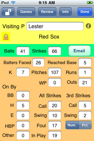
The screen below is one where the pitching results from a game are being reviewed after the game has finished. The toolbar is a bit different from the one already considered. The unlock button allows the editing of the pitcher’s name as before. The Games button is a new one for the app. It allows the user to go directly to the list of recorded games to choose another game to review. This required a couple of steps previously, and the steps were not as obvious as tapping an appropriately labeled button. The Review button is as before. It brings up the complete list of pitchers for which stats were kept in the game. The Done button is to make a new choice to either resume a game, start to record pitches for a new game, or review previous game results (which is what is already being done). Displaying the team name under the pitcher’s name when reviewing a game is also new.
main
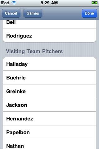
The screen below shows the list of pitchers with recorded stats for a certain game played last July. Note that the toolbar for this screen also has a Games button, making it easy for you to choose a different game if you decided to do so at this point for some reason. The Cancel button will take you back to whatever screen led to the currently showing one if you want to do that directly.
main
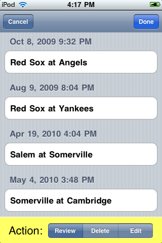
The screen below shows an example of a list of games for which pitch results have been recorded. The Cancel and Done buttons have the expected result. The new feature is the addition of an option in the control at the bottom to Edit a game. Select Edit and then tap on a game in order to edit the names of one or both of the teams in that contest.
main
All of the new features were requested by users. I think having an easier and more direct and obvious way to navigate from game to game when reviewing pitching performances previously recorded is by far the most important improvement. It was the app’s rather awkward navigation between games and pitchers that caused it to receive a couple of “Great app except for…” reviews. I’m hoping those reviewers will find it in their hearts to review OnScreen Pitch Count again after using this updated version and to give it that extra star in the rating. In any case, I have the satisfaction of knowing I’ve made a good app even better. If you don’t already have it, go check it out on the iTunes App Store.

OnScreen DNA Lite™ for iPhone Now Available

Tuesday, May 11th, 2010

I’m happy to say that OnScreen DNA Lite™ for iPhone can now be downloaded from the iTunes App Store. This is basically a smaller-screen version of the iPad app that was released when the iPad first became available, though adapting the app to the iPhone and iPod Touch required some modifications, which I’ll mention. Everything I said in the blog post “The Thinking Behind the OnScreen DNA Lite™ iPad App” applies to the new iPhone version. The same desire to “provide students (and all persons interested in DNA) with a way to reach a deeper, more intuitive understanding of DNA structure” motivates the development of both apps, and the same care to show DNA’s correct handedness, base-pairs per helical turn, etc. with a ball-and-stick virtual model was taken for each. What’s more, it’s a lot of fun to play with the DNA model through the touch screen control of its orientation and size in both versions of the app.

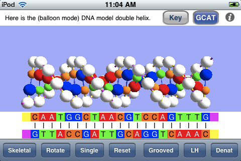
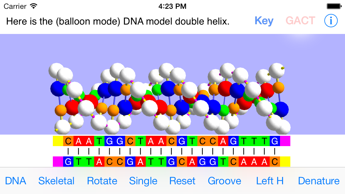
My last blog post, “An OnScreen DNA Lite™ for iPad Gallery“, showed the screen shots that are a part of the iTunes listing for that app and commented on them. As one way of comparing the two versions, let’s consider the corresponding screen shots for the iPhone app. Below is shown a screen shot from the iPhone version in which the linear (“GCAT”) representation of the base sequences of the DNA model is visible below the model. Because of the smaller screen area of the iPhone, this linear representation of the bases is only shown on demand. The button at the top designated GCAT shows and hides that view. Another accommodation to the smaller screen is the shortening of the DNA model. Instead of the thirty-five base pairs of the iPad model, the iPhone version has twenty-one, which is still sufficient to show adequately the full double helix structure and its features.

gcat

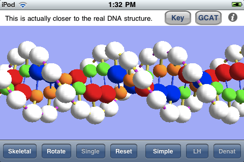
The screen shot below shows the DNA model enlarged (by means of the iPhone pinch-to-zoom technique) and with the linear view of the base sequences hidden. The structure is shown with major and minor grooves as the result of a button tap.

grooves

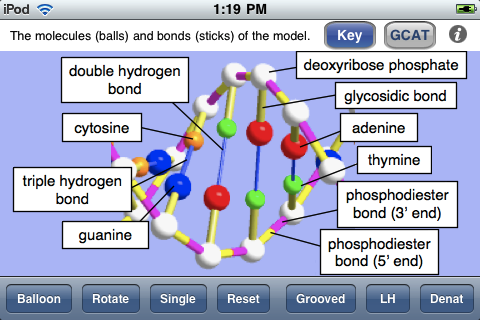
The next screen shot shows the key to the ball-and-stick model, indicating what each colored ball (molecule) and stick (chemical bond) is meant to represent. This is essentially the same view as the Details popover view in the iPad app.

key

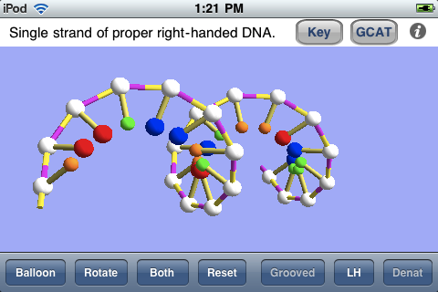
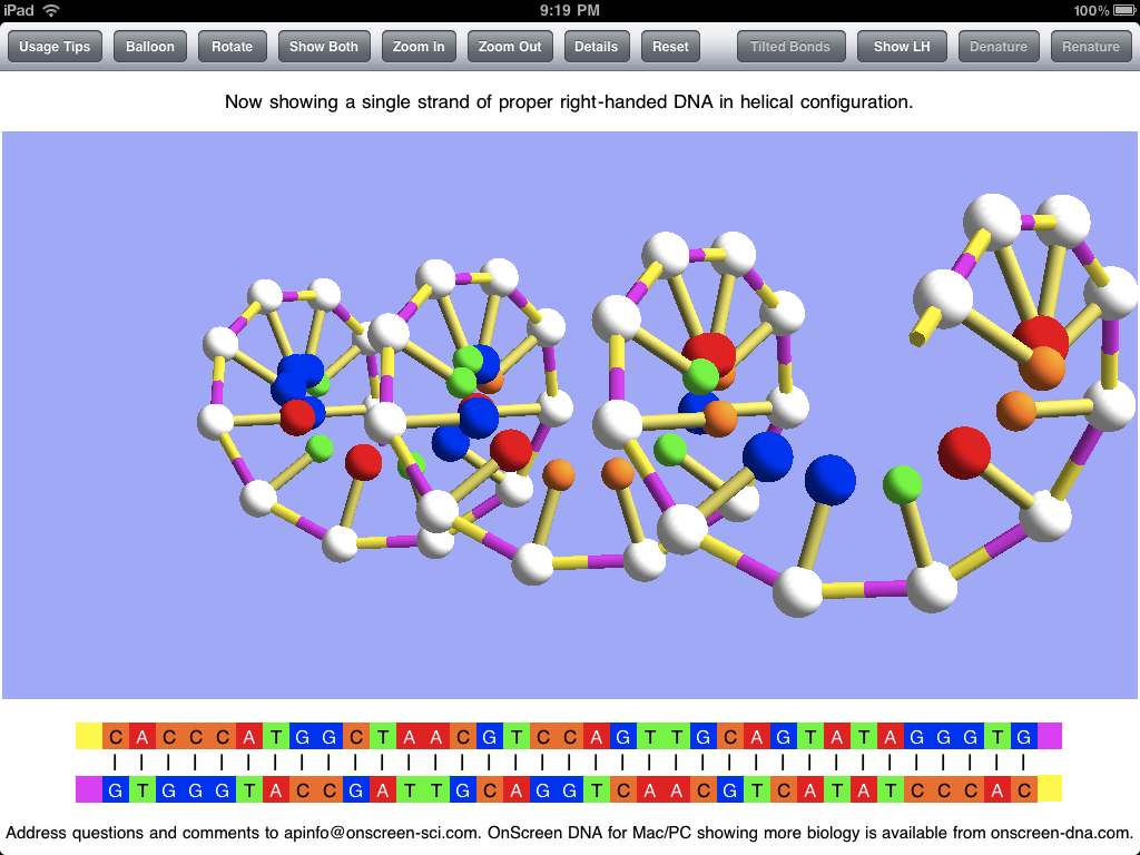
As in the iPad app, one can view a single strand of the DNA model, as shown below. This may be especially useful for grasping the meaning of the handedness of a helix, and the app also allows one to switch back and forth between natural right-handed DNA and imaginary left-handed DNA. The screen shot was taken with the model rotated by means of a finger swipe.

single

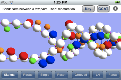
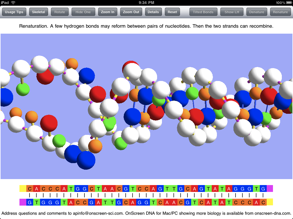
The screen shot below shows the simulated process of renaturation (rejoining together of the two strands, separated during denaturation) as it nears completion.

renat

Rather than repeat myself, I’ll just refer the interested reader to my previous two posts for more details about the virtual DNA model of OnScreen DNA Lite for iPad and now iPhone and iPod Touch.

An OnScreen DNA Lite™ for iPad Gallery

Tuesday, May 4th, 2010

Apple’s iTune App Store provides one standard way (and place) for “apps” developed for the iPhone and iPad to be displayed. The app store listing is really a pretty good way to learn something about an app once you’ve managed to reach the page devoted to it. Apple lets developers describe the app in under 4,000 characters and choose up to five screen shots of the app for display in its listing. The screen shots are presented without captions, so they basically need to tell their lisinopril own story.

I chose the screen shots used for the OnScreen DNA Lite listing on the iPad app store with the aim of trying to show various features, but I think a little description could be useful, so I’m presenting here those same screen shots with some explanatory text. The dimensions of these screen shots have been squeezed down to fit into the blog column, so the area of the images is less than a quarter of the iPad display’s.

Here below is the thirty-five base-pair double helix of OnScreen DNA Lite’s virtual model. Note the row of control buttons at the top. The display mode is what we have called “Balloon,” which just means that the balls used to represent molecules in the DNA structure are substantially larger than they are in the “Skeletal” mode in which the double helix structure may be more apparent. The Balloon mode is closer to the “space filling” representations sometimes shown, but not so much as to hide the structure. Since Balloon cytotec mode is in use, the button that controls this feature reads “Skeletal” to indicate that a tap of it will shift to the Skeletal representation.

double helix

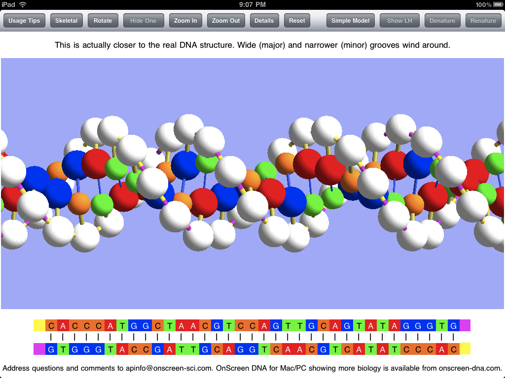
The sticks connecting the balls (molecules) in the model represent chemical bonds, which are less apparent in the Balloon mode. The model is shown above with “Tilted Bonds” (a button choice), which means that the sticks representing the glysosidic bonds between the deoxyribose phosphate molecules (white balls) and the nitrogenous bases (colored balls) are at an angle to the line between opposite sugar phosphates in the DNA strands. This propecia bond tilting is what causes the unequal spacing of the grooves (major and minor) that wind around the double helix structure. I expect to add a feature for making it obvious what these grooves are in a future update. The text in the panel above the image makes the point that the model with unequal grooves is more like the real DNA structure than the simpler model used priligy for the simulations.

Note that the bottom of the screen shots show the base sequences of the DNA strands of the model using the familiar letters GCAT (for guanine, cytosine, adenine, and thymine). The color coding is the same for the linear (letter) representation and the model.

The screen shot below shows the popover view that has the key to the model of OnScreen DNA Lite. It gives the names of all the molecules and chemical bonds shown in the model. Note that the phosphodiester bond has two parts indicated. The bond is shown with two colors to make it clear that there is a polarity to the DNA strands, and that they are of opposite polarity (“point” in opposite directions).

popover

The screen shot below shows the DNA model with one of the two strands hidden, which is accomplished by a button tap. This makes the helical structure of each strand apparent. Note that this shot is with the Skeletal mode selected. Natural DNA is right-handed, meaning that a strand circles around the axis of the helix in a clockwise fashion as it advances down the axis. This handedness may be easier to see with a single strand. To further make the concept of handedness clear, OnScreen DNA Lite also has the option to show what left-handed DNA would look like. In the screen shot the model has been rotated to the side and held there. This is easily (and satisfyingly) accomplished by a swipe of a finger on the iPad screen.

single strand

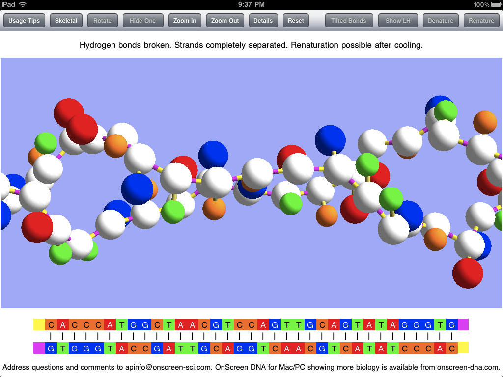
In addition to displaying the DNA model in various static (though rotatable) forms, OnScreen DNA Lite features a couple of simulations of phenomena that can occur with DNA in the laboratory. The first is denaturation, in which heating the DNA breaks the hydrogen bonds that keep the two strands joined together, thus allowing the strands to separate as single threads no longer bound to a helical shape. The screen shot below shows the two strands after denaturation has occurred, but the simulation that preceded it would have shown the strands being stretched and jiggled as the temperature increased, with individual bonds breaking until the double helix couldn’t be maintained. Note that, while showing that the hydrogen bonds are the most easily broken, an essential property for the functioning of DNA, which requires controlled strand separation at life-supporting temperatures (not the boiling temperature that brings on denaturation), denaturation is not a natural process occurring in living cells.

denatured

After the DNA strands have been separated in denaturation, it is possible (after the temperature has subsided) for them to recombine in the opposite process called renaturation. A few bases in one strand may come into sufficient contact with their complementary counterparts in the other strand to form a string of hydrogen bonds which can serve to hold the strands together long enough for other bonds to reform. This can be simulated in OnScreen DNA Lite after denaturation has occurred. The screen shot below captures an instant in the renaturation process after much of the double helix has been reformed, but before the process has been completed.

renaturation

Screen shots can be useful in getting a picture of what an app is like, but static pictures can’t really do justice to an app with dynamic simulations and with a model that can be rotated by touch. For the true experience you’ll need an iPad and the OnScreen DNA Lite app. But soon there will be a version for the iPhone and iPod Touch. For more on OnScreen DNA Lite for iPad see The Thinking Behind the OnScreen DNA Lite™ iPad App.