Archive for the ‘iPhone Development’ Category

Welcome to Boston, Science Teachers! Have a Free DNA App!

Wednesday, April 2nd, 2014

The National Science Teachers Association (NSTA) is having its national meeting in Boston, April 3-6. Around 10,000 science teachers and school administrators are expected to attend. Given that I live a subway ride away from the meeting site, it was a no-brainer for me to take advantage of this opportunity to see what is going on the world of science teaching, to which I feel I belong, but only as a virtual teacher, making apps to teach science. I expect to talk to some of the people that have direct contact with students every day. I’m hoping to get some useful critiques of my apps, as well as making more people aware of them.

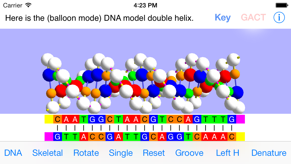
As part of this effort to make more science teachers, especially biology teachers, aware of my suite of interactive DNA apps, I’m making OnScreen DNA Model for iPhone (usually $2.99) free for the duration of the NSTA meeting (through April 6). This app, except for the smaller screen size and consequent shorter DNA strands, is identical to the iPad app OnScreen DNA Model. The other OnScreen Science apps dealing with nucleic acids in the cell are iPad-only. I recently wrote about some good reviews they’ve received, including three for inclusion in the NSTA Recommends online database. Links (App Store buttons) to the other apps can be found in the right sidebar. Of course, OnScreen DNA Model for iPhone is now free to anyone.

Here is the link to the free appOnScreen DNA Model for iPhone.

Enjoy, spread the word, and, if you like the app, please go to the App Store to rate and review it.

dna model

We’re Celebrating DNA Day (April 20) with a One-Day Sale: All DNA Apps Only 99¢!

Friday, April 20th, 2012

From the National Humane Genome Research Institute website: “DNA Day is a unique day when students, teachers and the public can learn more about genetics and genomics! The day commemorates the completion of the Human Genome Project in April 2003, and the discovery of DNA’s double helix. This year, NHGRI will celebrate National DNA Day on April 20, 2012.”

We are reducing our price on DNA-related apps to 99¢ for the day. The apps to be priced at 99¢ on April 20 are:

OnScreen DNA Model for iPad (regularly $3.99)

OnScreen Gene Transcription for iPad (regularly $3.99)


OnScreen DNA Model for iPhone
(regularly $2.99) 

OnScreen DNA Model on the Mac App Store (regularly $3.99)

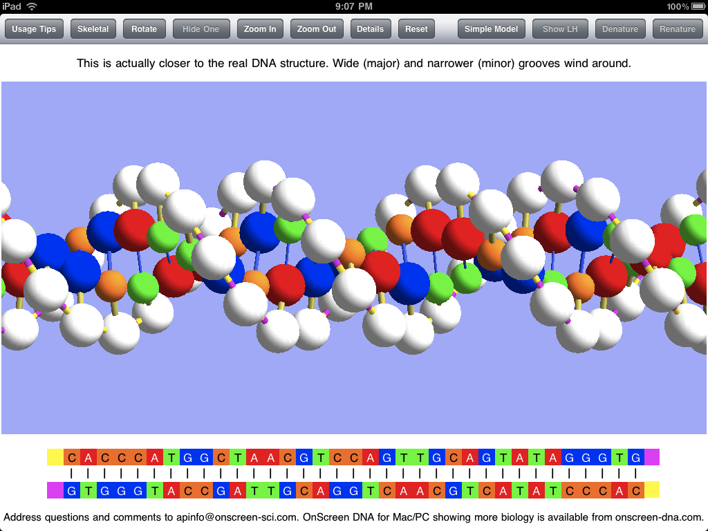
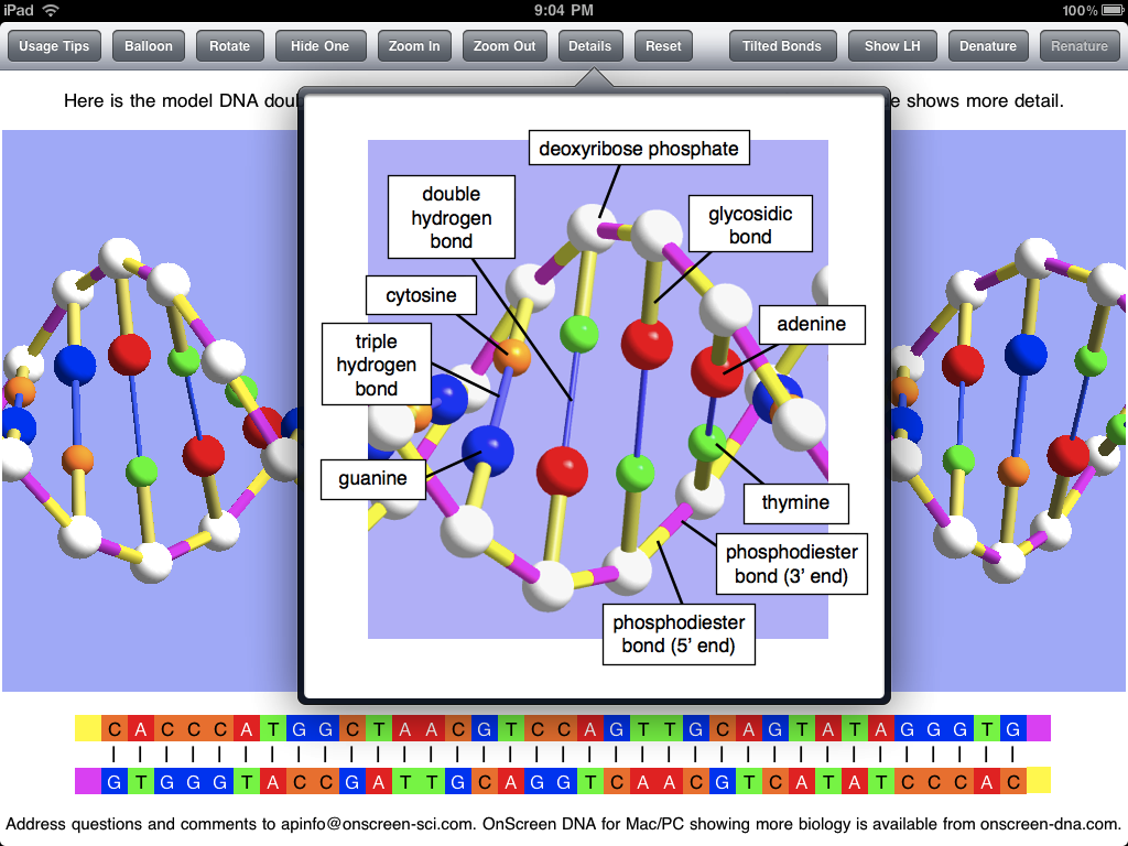
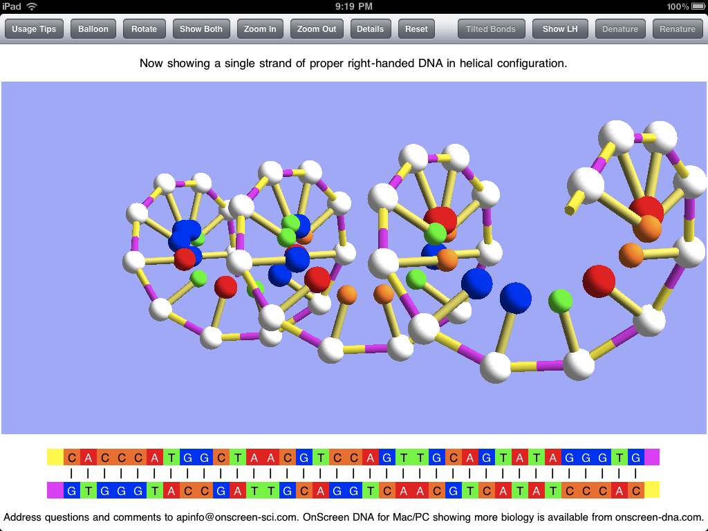
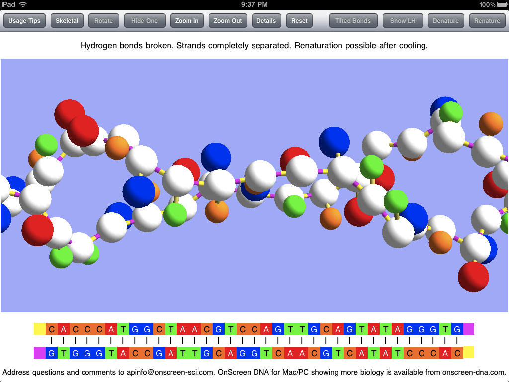
The OnScreen DNA Model apps focus on the details of DNA’s double helix structure, using a 3D, color-coded, virtual model that the user can rotate and zoom. Explanatory text deals with the molecules and chemical bonds of the double helix. Animations show two important lab phenomena of DNA: denaturation, in which the strands separate, and renaturation, in which they reunite.

OnScreen Gene Transcription makes use of the same DNA model to show how a genetic recipe stored in the sequence of molecules of DNA is copied by construction of a messenger RNA molecule. The various steps in the process, shown in animations, are described in some detail, emphasizing the role of certain enzymes.

The apps show details of structure and process that are sometimes depicted in erroneous ways in places that should know better. Discussion of the chemistry involved is at an introductory level, so the apps are useful for learning about DNA to a wide range of students or anyone interested in the science of Life.

iPhone App Update Roundup

Wednesday, August 11th, 2010

I’ve gotten three of the OnScreen Science, Inc. iPhone apps reworked for iOS 4 and the new iPhone 4. Two of them—OnScreen Pitch Count 1.5 and OnScreen GPA Pro 1.2—have been approved and are now on sale. OnScreen DNA Lite for iPhone 1.1 is still in the queue for review. If things proceed as for the other two (week of waiting, a few hours in review), then the update of the third app should be on sale August 12 or 13. The update of the fourth app, OnScreen QB Stats, involved more than just making it work and look good under the new system and on the high-definition “Retina” screen of the new iPhone. I wanted to give it the same improved user interface and navigation among games and players that OnScreen Pitch Count had recently received, so it is taking a little longer. Given that football season is still a ways off, OnScreen QB Stats was a lower priority. Assuming the rest of testing and debugging is not prolonged, that update should be on sale by around August 20.

One of the nifty new features of iOS 4 on later generation iPhones and iPod Touches is multitasking. Whether or not it’s “true multitasking,” Apple’s implementation of the feature allows for keeping an app in memory when a new app is chosen to run on the same device, and then later to quickly switch back to the original app without having to load it again. Since the OnScreen Science apps had been programmed to remember where they had been whenever the user jumped to another app, so that they could resume right where they left off upon relaunch, the only difference with multitasking will be in the speed of resumption, but a second or two is a second or two.

The other essential part of updating for the latest iPhone is to make sure the screen displays of the app look good on the Retina screen. That means a developer has to produce and include higher resolution versions of any images and icons that the app displays. New screen shots for the iTunes App Store display of the app also have to be submitted. These were straightforward but somewhat tedious tasks. There weren’t many such images, so I had it easy compared to some people.

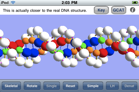
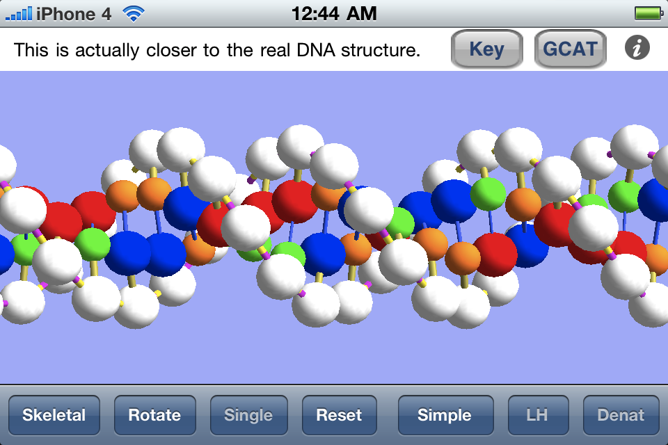
The one app I was worried about providing a nice iPhone 4 version for was OnScreen DNA Lite for iPhone. The virtual DNA model is drawn in 3D using the iOS implementation of OpenGL ES. The drawing assumes a certain pixel density, which is way off for the Retina display of the iPhone 4 which has a higher pixel density. Images drawn with the unmodified OpenGL code are displayed on the Retina screen just by blowing them up, so that they actually look worse—much more jagged—than they did on the old iPhone. It took me a while to figure it out, but the solution was very simple. I only needed to put in a test for what device the app was running on, and in case it was iPhone 4 make a change to one line of the old code (doubling the dimensions of glViewport for the iPhone 4) and add a call to scale the image by a factor of 2. I couldn’t believe my luck when I tried just that and saw it was all my code needed. Not only does the iPhone 4 version look better than the old version did on the iPhone 4, it looks better than the old version did on the old iPhone, since it takes advantage of the higher definition screen (extra pixels) during the image rendering. This can be seen in the comparison below.

old dna image

Above is a screen shot from the original iPhone running OnScreen DNA Lite for iPhone.

iphone4 dna image

Above is a screen shot from an iPhone 4 running OnScreen DNA Lite for iPhone.

There was another update to OnScreen Pitch Count before the latest version 1.5. A user had encountered the problem of not being able to view the pitching stats for the last couple of pitchers when he’d kept track of pitches for numerous pitchers on both teams. This turned out to be a bug I’d introduced in version 1.4 when I failed to take into account a change in view dimensions made necessary by the addtion of a toolbar at the top of the screen. The user called me to point out the bug, and I was grateful for that. I had a fix submitted in a day or two. I had already been working on the iOS 4 upgrade, but felt I needed to get the bug fix online as soon as possible without waiting for completion of the other changes, which is why 1.5 followed 1.4.1 so closely.

OnScreen Pitch Count Update 1.4 Now on iTunes App Store

Monday, June 14th, 2010

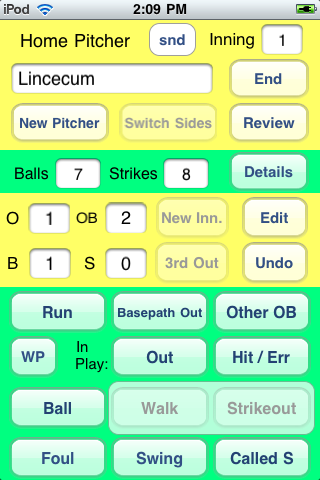
A new version of OnScreen Pitch Count, the most complete, easy-to-use app for recording baseball pitch results on the iPhone and iPod Touch, is now available. Getting OnScreen Pitch Count to the point where it did its main job well and reliably in a way that was quickly learned was my top priority, and I think I was successful in that right from the first release. With time I’ve been able to add features such as emailing results, including attachments that can be imported into spreadsheets. This new update is more in the nature of a polishing than one that introduces big changes. I’ll just use a few screen shots as the quickest way to point out the differences from earlier versions. I recommend downloading the new User Guide for more complete details.

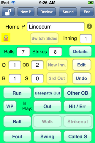
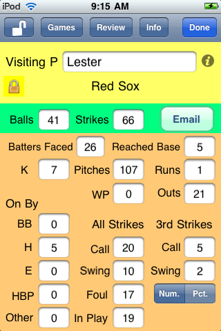
An obvious difference to anyone that’s used the app before is the presence of a toolbar at the top of the different screens of the app. The main screen in which pitch data is entered is shown below. The four toolbar buttons with titles, none of which are used for recording pitch results, were formerly elsewhere on the screen and just do what they always have. The totally new control is the one with the opened lock icon on the left of the bar. A bit below it, in the top yellow region, is a closed lock, which indicates that the screen is locked, its normal condition. As one might expect, tapping the button unlocks the screen and changes the icon indicating the lock state to show an open lock. So what does unlocking do? Two things really. First, it makes it possible to edit the pitcher’s name. Previously, once the name had been entered and saved it couldn’t be changed. Obviously, there are times you might want to change the name, including of course when you’ve misspelled the name for some reason, but also when you’ve only learned the pitcher’s name sometime after the game started, or even after it ended. Unlocking allows you to change the pitcher’s name both during the course of the game or later when you’re reviewing it.

The other thing unlocking does is to make it possible to terminate an inning before three outs have been recorded. This is something that comes up in leagues with limits on runs scored or total batters in an inning. Having coached in a minor Little League that only allowed a team to bat once through its complete order in an inning, I should have thought of this myself, but I had it pointed out to me by a user who coaches a Little League team in Texas. Thanks, Daren. Unless the screen is unlocked with the toolbar button, the New Inning and Switch Sides buttons are disabled (as shown) until the third out of the inning has been recorded, in keeping with my philosophy of preventing accidental taps that can mess up pitch recording. But this was a clear case where an override was needed.
main
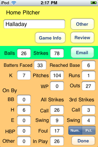
The screen below is one where the pitching results from a game are being reviewed after the game has finished. The toolbar is a bit different from the one already considered. The unlock button allows the editing of the pitcher’s name as before. The Games button is a new one for the app. It allows the user to go directly to the list of recorded games to choose another game to review. This required a couple of steps previously, and the steps were not as obvious as tapping an appropriately labeled button. The Review button is as before. It brings up the complete list of pitchers for which stats were kept in the game. The Done button is to make a new choice to either resume a game, start to record pitches for a new game, or review previous game results (which is what is already being done). Displaying the team name under the pitcher’s name when reviewing a game is also new.
main
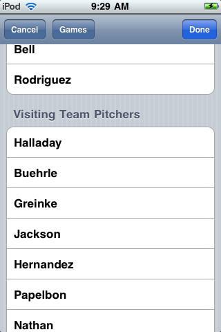
The screen below shows the list of pitchers with recorded stats for a certain game played last July. Note that the toolbar for this screen also has a Games button, making it easy for you to choose a different game if you decided to do so at this point for some reason. The Cancel button will take you back to whatever screen led to the currently showing one if you want to do that directly.
main
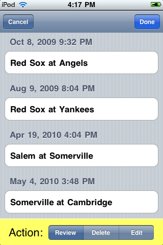
The screen below shows an example of a list of games for which pitch results have been recorded. The Cancel and Done buttons have the expected result. The new feature is the addition of an option in the control at the bottom to Edit a game. Select Edit and then tap on a game in order to edit the names of one or both of the teams in that contest.
main
All of the new features were requested by users. I think having an easier and more direct and obvious way to navigate from game to game when reviewing pitching performances previously recorded is by far the most important improvement. It was the app’s rather awkward navigation between games and pitchers that caused it to receive a couple of “Great app except for…” reviews. I’m hoping those reviewers will find it in their hearts to review OnScreen Pitch Count again after using this updated version and to give it that extra star in the rating. In any case, I have the satisfaction of knowing I’ve made a good app even better. If you don’t already have it, go check it out on the iTunes App Store.

OnScreen DNA Lite™ for iPhone Now Available

Tuesday, May 11th, 2010

I’m happy to say that OnScreen DNA Lite™ for iPhone can now be downloaded from the iTunes App Store. This is basically a smaller-screen version of the iPad app that was released when the iPad first became available, though adapting the app to the iPhone and iPod Touch required some modifications, which I’ll mention. Everything I said in the blog post “The Thinking Behind the OnScreen DNA Lite™ iPad App” applies to the new iPhone version. The same desire to “provide students (and all persons interested in DNA) with a way to reach a deeper, more intuitive understanding of DNA structure” motivates the development of both apps, and the same care to show DNA’s correct handedness, base-pairs per helical turn, etc. with a ball-and-stick virtual model was taken for each. What’s more, it’s a lot of fun to play with the DNA model through the touch screen control of its orientation and size in both versions of the app.

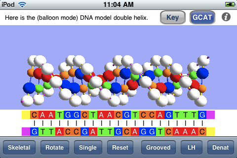
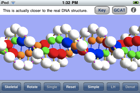
My last blog post, “An OnScreen DNA Lite™ for iPad Gallery“, showed the screen shots that are a part of the iTunes listing for that app and commented on them. As one way of comparing the two versions, let’s consider the corresponding screen shots for the iPhone app. Below is shown a screen shot from the iPhone version in which the linear (“GCAT”) representation of the base sequences of the DNA model is visible below the model. Because of the smaller screen area of the iPhone, this linear representation of the bases is only shown on demand. The button at the top designated GCAT shows and hides that view. Another accommodation to the smaller screen is the shortening of the DNA model. Instead of the thirty-five base pairs of the iPad model, the iPhone version has twenty-one, which is still sufficient to show adequately the full double helix structure and its features.

gcat

The screen shot below shows the DNA model enlarged (by means of the iPhone pinch-to-zoom technique) and with the linear view of the base sequences hidden. The structure is shown with major and minor grooves as the result of a button tap.

grooves

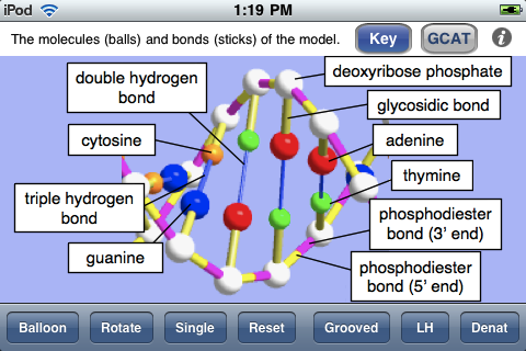
The next screen shot shows the key to the ball-and-stick model, indicating what each colored ball (molecule) and stick (chemical bond) is meant to represent. This is essentially the same view as the Details popover view in the iPad app.

key

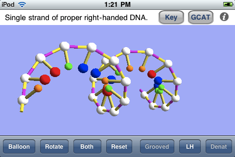
As in the iPad app, one can view a single strand of the DNA model, as shown below. This may be especially useful for grasping the meaning of the handedness of a helix, and the app also allows one to switch back and forth between natural right-handed DNA and imaginary left-handed DNA. The screen shot was taken with the model rotated by means of a finger swipe.

single

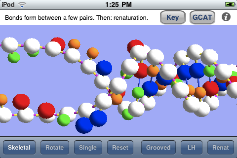
The screen shot below shows the simulated process of renaturation (rejoining together of the two strands, separated during denaturation) as it nears completion.

renat

Rather than repeat myself, I’ll just refer the interested reader to my previous two posts for more details about the virtual DNA model of OnScreen DNA Lite for iPad and now iPhone and iPod Touch.

An OnScreen DNA Lite™ for iPad Gallery

Tuesday, May 4th, 2010

Apple’s iTune App Store provides one standard way (and place) for “apps” developed for the iPhone and iPad to be displayed. The app store listing is really a pretty good way to learn something about an app once you’ve managed to reach the page devoted to it. Apple lets developers describe the app in under 4,000 characters and choose up to five screen shots of the app for display in its listing. The screen shots are presented without captions, so they basically need to tell their lisinopril own story.

I chose the screen shots used for the OnScreen DNA Lite listing on the iPad app store with the aim of trying to show various features, but I think a little description could be useful, so I’m presenting here those same screen shots with some explanatory text. The dimensions of these screen shots have been squeezed down to fit into the blog column, so the area of the images is less than a quarter of the iPad display’s.

Here below is the thirty-five base-pair double helix of OnScreen DNA Lite’s virtual model. Note the row of control buttons at the top. The display mode is what we have called “Balloon,” which just means that the balls used to represent molecules in the DNA structure are substantially larger than they are in the “Skeletal” mode in which the double helix structure may be more apparent. The Balloon mode is closer to the “space filling” representations sometimes shown, but not so much as to hide the structure. Since Balloon cytotec mode is in use, the button that controls this feature reads “Skeletal” to indicate that a tap of it will shift to the Skeletal representation.

double helix

The sticks connecting the balls (molecules) in the model represent chemical bonds, which are less apparent in the Balloon mode. The model is shown above with “Tilted Bonds” (a button choice), which means that the sticks representing the glysosidic bonds between the deoxyribose phosphate molecules (white balls) and the nitrogenous bases (colored balls) are at an angle to the line between opposite sugar phosphates in the DNA strands. This propecia bond tilting is what causes the unequal spacing of the grooves (major and minor) that wind around the double helix structure. I expect to add a feature for making it obvious what these grooves are in a future update. The text in the panel above the image makes the point that the model with unequal grooves is more like the real DNA structure than the simpler model used priligy for the simulations.

Note that the bottom of the screen shots show the base sequences of the DNA strands of the model using the familiar letters GCAT (for guanine, cytosine, adenine, and thymine). The color coding is the same for the linear (letter) representation and the model.

The screen shot below shows the popover view that has the key to the model of OnScreen DNA Lite. It gives the names of all the molecules and chemical bonds shown in the model. Note that the phosphodiester bond has two parts indicated. The bond is shown with two colors to make it clear that there is a polarity to the DNA strands, and that they are of opposite polarity (“point” in opposite directions).

popover

The screen shot below shows the DNA model with one of the two strands hidden, which is accomplished by a button tap. This makes the helical structure of each strand apparent. Note that this shot is with the Skeletal mode selected. Natural DNA is right-handed, meaning that a strand circles around the axis of the helix in a clockwise fashion as it advances down the axis. This handedness may be easier to see with a single strand. To further make the concept of handedness clear, OnScreen DNA Lite also has the option to show what left-handed DNA would look like. In the screen shot the model has been rotated to the side and held there. This is easily (and satisfyingly) accomplished by a swipe of a finger on the iPad screen.

single strand

In addition to displaying the DNA model in various static (though rotatable) forms, OnScreen DNA Lite features a couple of simulations of phenomena that can occur with DNA in the laboratory. The first is denaturation, in which heating the DNA breaks the hydrogen bonds that keep the two strands joined together, thus allowing the strands to separate as single threads no longer bound to a helical shape. The screen shot below shows the two strands after denaturation has occurred, but the simulation that preceded it would have shown the strands being stretched and jiggled as the temperature increased, with individual bonds breaking until the double helix couldn’t be maintained. Note that, while showing that the hydrogen bonds are the most easily broken, an essential property for the functioning of DNA, which requires controlled strand separation at life-supporting temperatures (not the boiling temperature that brings on denaturation), denaturation is not a natural process occurring in living cells.

denatured

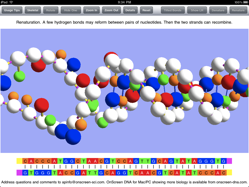
After the DNA strands have been separated in denaturation, it is possible (after the temperature has subsided) for them to recombine in the opposite process called renaturation. A few bases in one strand may come into sufficient contact with their complementary counterparts in the other strand to form a string of hydrogen bonds which can serve to hold the strands together long enough for other bonds to reform. This can be simulated in OnScreen DNA Lite after denaturation has occurred. The screen shot below captures an instant in the renaturation process after much of the double helix has been reformed, but before the process has been completed.

renaturation

Screen shots can be useful in getting a picture of what an app is like, but static pictures can’t really do justice to an app with dynamic simulations and with a model that can be rotated by touch. For the true experience you’ll need an iPad and the OnScreen DNA Lite app. But soon there will be a version for the iPhone and iPod Touch. For more on OnScreen DNA Lite for iPad see The Thinking Behind the OnScreen DNA Lite™ iPad App.

The Thinking Behind the OnScreen DNA Lite™ iPad App

Friday, April 2nd, 2010

My first iPad app, now ready for sale on the iTunes App Store even before the iPad has gotten into many hands, is called OnScreen DNA Lite. Check it out! I plan to relate something of the hectic development of this app in a later post. Here my aim is to describe the iPad app a little and to motivate its development. The app is based on OnScreen DNA, a science education program I created a few years ago, first for the Macintosh OS X, and somewhat later for the Windows side. My primary goal in developing OnScreen DNA was to provide students (and all persons interested in DNA) with a way to reach a deeper, more intuitive understanding of DNA structure than I felt they were likely to obtain from reading text and looking at two-dimensional static images of a DNA model. I wanted to create a virtual, three-dimensional model that had most of the virtues of a real, physical one plus the enhanced power to simulate DNA processes with animations.

OnScreen DNA Lite’s computer model, programmed with three-dimensional perspective, is of the simple ball-and-stick type, in which the balls represent molecules, and the sticks represent the chemical bonds between these constituent molecules. A guiding principle in development was to make the relative dimensions of the model agree with those of the actual DNA molecule to the degree that makes sense for a ball and stick model. This meant getting the ratio between helical radius and the distance along the helix required for the molecular chain to make a complete revolution right, as well as showing the proper offset between molecules paired oppositely with one another in the two DNA strands. The distance between molecules in a strand, and hence the number of molecules in a complete revolution of the helical strand also had to be right.

Another crucial structural detail of the virtual helices that needed to conform with that of natural DNA was the handedness. The concept of handedness, which refers to the sense in which each helical strand winds around its axis, is one that seems largely to have escaped notice by those who make artistic renditions of DNA. My observation is that roughly half (the fraction predicted by a random guess) of all depictions of DNA show left-handed DNA, when in fact natural DNA (or all but a tiny fraction of it) in living cells is right-handed. OnScreen DNA Lite makes it easy to see the difference between right and left handed DNA by allowing the user to switch back and forth between the two.

In addition to showing the relative positions of constituent molecules in the DNA strands, the OnScreen DNA model uses color coding to identify the various molecular parts and chemical bonds. This is meant to give visual reality to the idea that a molecule of one type (color) will make a cross-strand bond with only one other type (a different color). The molecules that form a connection between their respective strands are represented by one another’s complementary colors. The color also makes the visual point that the molecules (nucleotides) making up the DNA chains differ from one another only in the parts (nitrogenous bases) that make up the cross-strand pairs, while the connections that form the individual strands are between molecular components that are identical. This can all be said, of course, and should be said, but the colors in the model make the point in an immediately memorable way.

The molecules (sugar phosphates) that link together to form the chain of a strand do so in a particular way. Think of elephants forming a line by each elephant (except for the lead elephant) grasping with its trunk the tail of the one in front of it. The molecules have an asymmetry (think of trunk and tail) as well, and they form bonds between dissimilar parts (the “tail” being the part of the molecule where the phosphorus atom is). Thus we can think of a strand of DNA as “pointing” in a given direction just as the line of elephants heads in a certain direction. We say the DNA strand has a certain polarity (as a bar magnet has polarity: N at one end, S at the other). It turns out that in the real world, the two DNA strands in a double helix are aligned with opposite polarity. They point in opposite directions. The color coding of the OnScreen DNA model reflects this feature as well, visually indicating it in the colors of the relevant chemical bonds.

In order to perform its biological function in living cells, the DNA molecule must at times have portions of its two strands separate from each other. The separation and unwinding of the strands, and the nucleic acid chain constructions involved in these processes are orchestrated by complex proteins called enzymes that catalyze just the right reactions at the right time and place in the required sequence. In the full OnScreen DNA edition, animated simulations are used to show how this occurs. OnScreen DNA Lite does not include these biological processes, but it does show how the laboratory process called denaturation takes place. The temperature required to achieve this is too high for a living cell to survive, but in the lab, the jiggling of the the double helix at the high temperarture is strong enough to break the bonds holding the two strings together. OnScreen DNA Lite for iPad animates this process, finally arriving at the point where the two strands are completely separated from each other and no longer have any helical shape, just as happens to real DNA in the lab under heating. The reverse process, in which bonds reform between complementary pairs to recombine the two strands into a double helix can also occur, and OnScreen DNA simulates this phenomenon of renaturation also.

Even though the biological functioning of DNA is not demonstrated by OnScreen DNA Lite, its animations can serve to make the point that the hydrogen bonds connecting the two intertwined strands to each other are much weaker than the other chemical bonds of the DNA molecule, a fact that is crucial for the strand separation that has to take place in the biological processes. Furthermore, I believe that seeing the strands in the act of recombining makes the fact of their entwinement all the more memorable, which is important because it seems it can be lost to consciousness when only two-dimensional images or the typical ladder-like double strand renderings are seen.

The desktop version of OnScreen DNA allows the user, by means of the mouse, to rotate the model about its helical axis and about an axis perpendicular to that. Making these rotations serves to enhance comprehension of exactly how the double helix structure is put together and to fix its three-dimensional geometrical shape in the mind. Causing the on-screen rotation by dragging the mouse pointer across the screen is fun, but the pointer on the screen is at a distance from the hand directing it. I, along with almost all other developers of iPad apps, was without the benefit of an actual iPad on which to test the app I was making and thus had to use the iPad simulator that runs on the Macintosh to see what the app should look like on the real device. Thus I was deprived of the tactile part of the iPad experience, as mouse clicks and drags had to simulate their finger-on-screen counterparts. I did, however, have a chance to test on a real iPod Touch the prototype of OnScreen DNA Lite for iPhone, and I loved how I could make the double helix rotate by moving my finger on the screen. It was much closer to dealing directly with a physical object, and much more satisfying. I can’t wait to get my iPad and to start making further improvements to OnScreen DNA Lite for iPad.

OnScreen Pitch Count 1.3 Is Now on the iTunes App Store

Saturday, March 13th, 2010

A new version of OnScreen Pitch Count (1.3), my iPhone and iPod Touch app for recording, calculating, and reviewing pitch results and stats of baseball and softball games is now available. A major improvement to the app is the new ability to email pitch data from a game as an attached file in csv (comma-separated values) format. The csv format is one easily imported into spreadsheet programs such as Excel. Once you have the data in a spreadsheet, you can perform any of the many operations available, such as totaling the various pitch quantities for the all the pitchers in the game and so on. Also, once the data is in the spreadsheet’s rows and columns, it can be easily transferred by cut and paste to a master spreadsheet you may be maintaining with full season results, for example. The email can be sent with an attachment or with just a text summary of the results without even leaving the app. The attachment feature is one that a few OnScreen Pitch Count users had requested, so I’m glad to have it up and running.

The other major addition is the ability to record wild pitches. There is a new button to tap after a wild pitch occurs. A wild pitch is only recorded when a pitcher throws a ball beyond the catcher’s reach with the result that a base runner is able to advance; so the wild pitch (WP) button is only enabled when there is at least one base runner. This should minimize accidental wild pitch recording. This disabling of the button needs to be taken into account in a couple of instances though. When a runner reaches first base after a missed third strike due to a wild pitch, the user should first put the runner on base with the Other OB button, and then record the wild pitch. If the sole base runner scores on a wild pitch, the wild pitch needs to be recorded before the run is recorded, since that removes the sole runner from the bases and disables the WP button. This is only logical, but might not be obvious the first time. These cases are pointed out in the new pdf User’s Guide for OnScreen Pitch Count available for download online. Wild pitches are common at lower levels of youth baseball and softball, so this can be an important statistic in evaluating how a pitcher is doing and in getting to all the factors that contribute to run scoring.

The screen shots below show the new wild pitch (WP) button and the display for the number of wild pitches. It required a little shifting of buttons and labels around, but the result was good and uncrowded.

main

Above is the main screen on which pitch results are recorded by button taps.

details

Above is the screen in which cumulative game pitch totals are displayed.

A coach from Texas called me a couple of weeks ago with a question about OnScreen Pitch Count, which he was planning to use in a game that evening. I confess I was jealous. I’m sitting here in New England on a cold, rainy night, knowing baseball and softball are a month away, and with lots of cold rainouts to come even then. Not only that, when the season starts I won’t be getting a team of kids ready as I did for years in the past. It’s a nostalgic time for memories of when my kids were little. My daughter is still playing, a high school sophomore softball pitcher, and I’ll be there in the stands with OnScreen Pitch Count for all the games I can get to. It’s a good feeling to know there are others (though far from enough!) now using this app I created to capture the pitch results that I, as a coach, would have liked to have had.

You can download OnScreen Pitch Count from the iTunes app Store or find out more about it, including a video and the User’s Guide, at nondummies.com. Previous blog posts (“OnScreen Pitch Count: An iPhone App Preview”, “OnScreen Pitch Count Now On Sale on iTunes App Store!”, and “IPhone App Updates and Experiences”) say more about OnScreen Pitch Count and some of my experiences developing and presenting it.

Free! One Week Only—OnScreen GPA Pro

Thursday, February 25th, 2010

OnScreen GPA Pro for iPhone and iPod Touch, the latest app from OnScreen Science, Inc., has been available from the iTunes App Store for a little over a week. This grade-point-average calculator, with an option for multiple students, features customizable calculation formulas and an easy way to make what-if projections of GPA.

The app debuted on what turned out to be a bad day. Usually when an app first appears on the store it gets a chance to be on the first page for apps in its category ordered by release date for a day or two. There were so many apps released on the same day that, due to its assigned time of release, OnScreen GPA Pro ended up near the bottom of page 4 in the Education category from the start and then went to page 9 (virtual oblivion) the next day. It makes a lot of difference from the standpoint of initial sales to be visible on those first couple of days. Having missed that opportunity, OnScreen GPA Pro has had to rely from the start on people using the iTunes search system to come across it. A search on “GPA” brings up several apps, and, as a newcomer, OnScreen GPA Pro is not near the top of the list, not even visible unless the person chooses “Show All,” which makes it less likely people will check out its features to discover the extra power it diflucan offers.

One of the things that’s making it harder to even get that initial visibility due to a new release on the iTunes App store is that quite a few developers are releasing suites of apps all at the same time. For example, OnScreen QB Stats got swamped by a slew of apps that just followed NFL players on Twitter. There was a separate app for each team! OnScreen GPA Pro ran into a couple of foreign language series. I wish Apple would come up with a way to show a suite of apps as a single entry.

Since I last wrote about OnScreen GPA Pro, I’ve made a four-minute video to illustrate how it works. Also note that the OnScreen GPA Pro User’s Guide is online.

In order to get OnScreen GPA Pro onto more iPhones and iPod Touches and hopefully to thereby generate some good word-of-mouth (or blog) advertising, I’m making the app free for a week. Just go here and download it. If you like OnScreen GPA Pro, I hope you’ll rate it and perhaps write a brief review. If you don’t like it—and especially if you encounter a problem—please email me about it, whether or not you lasix rate it.

Tell anyone you know who might be interested in having https://www.worthingdentalcentre.co.uk/lasix-online/ an easy way of calculating GPA and having handy access to GPA records about this limited-time free download.

OnScreen GPA Pro: An iPhone App Preview

Wednesday, February 10th, 2010

My very long absence from this blog has been due once again to work on an iPhone app, but I plan to take a break from coding, assuming the app, which I just submitted to Apple for approval today, doesn’t require quick revision. As the title of this post no doubt indicated to anyone potentially interested in the app, it is an app that calculates grade point averages, universally known as GPA among those concerned with them. My first encounter with the concept was as a college undergraduate. My high school had kept what amounted to an equivalent sort of average, the one where an A was a 95 and so on. In college, where courses might have different credit values assigned to them, a different method was needed, based on the idea that, for example, making an A in a 4 credit course and a B in a 3 credit course was a better result than if the grades for the two courses were swapped. So grade points were assigned by multiplying the worth of the grade times the credits for the course, with an A being worth 4, a B worth 3, and so on. Add the grade points up and divide by the sum of the credit values of the courses to obtain the GPA. For historical accuracy, I should state that the University of Texas in my day used a 3 point maximum (for all A’s) system, but the principle was the same.

It seems most high schools have by now adopted the GPA method of ranking students. That much I understood, but in recent years I became aware of a wrinkle that has been added to high school GPA calculation. At my kids’ high school, an honors class gets an extra half a point added to its grade, making a 4.5 the maximum grade point per credit for an honors class, while an Advanced Placement (AP) course gets a full extra point added. I suppose one motivation for this “weighting” of grades (as its called, though I’d have called it “incrementing,” since there’s not really a multiplicative factor involved) is to encourage students to take the more challenging courses without fear of bringing down their GPA. Of course it also encourages students that are competing for class ranking and to get into very competitive colleges to load up on AP courses. Given that weighting of courses seems to have become the rule, that then puts students at high schools that don’t offer AP courses at a disadvantage, which has led some colleges to look rather at “unweighted” GPA. Other college admissions offices may keep the weighting, but eliminate the non-academic classses such as gym, as they recompute the GPA.

Thus there can really be a number of GPA a high school student might be interested in knowing. A college student needn’t consider weighting, so far as I know, but a student planning to apply to graduate schools may need to be mainly concerned with grades in the major subject, possibly only the upper division courses. I know that as a physics undergraduate, I was given to believe that my GPA in upper divsion math and physics courses were what mainly mattered. It was these sorts of considerations that convinced me that a flexible GPA-calculating app that allowed the user to maintain a set of customizable formulas for doing the calculations would be worth developing, since from what I could tell there wasn’t such an app already being sold.

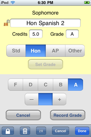
To obtain the flexibility I wanted, the app would need not only to do weighted and unweighted calculations, it would also have to provide an easy way to include or exclude certain courses such as non-academic ones or courses outside the major. So in addition to having standard, honors, and AP categories, I added an “other” option, just for ease in selecting whether to use a course in a given calculation. An example of a course definition is show in the app screen shot below.
course

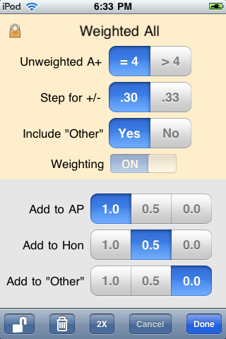
An example of a calculation method with the choices available is shown below. The user can create just those of the four possible definitions (weighted/unweighted with others included/excluded) wanted for the GPA records. When I say four, I’m assuming the other options of grade step and A+ handling would be the same for all calculations of interest, which might conceivably not be the case.
method

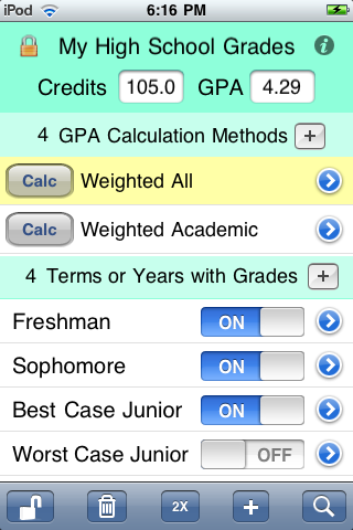
If even those four aren’t enough for a particular case, I’ve made it easy to duplicate a whole year’s (or other term’s) courses. Thus there could be two versions of the Sophomore Year with some courses absent from one of them. A simple on/off switch in the list of terms makes for easy switching between the two cases. This feature of optional inclusion of a term in the GPA calculation can also be used for calculating the GPA under different future scenarios. Note the “Best Case” and “Worst Case” Junior Year options in the screen shot below.
main

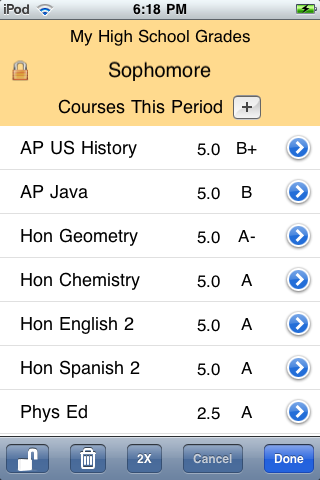
An example of the courses defined for a full term is shown below.
term

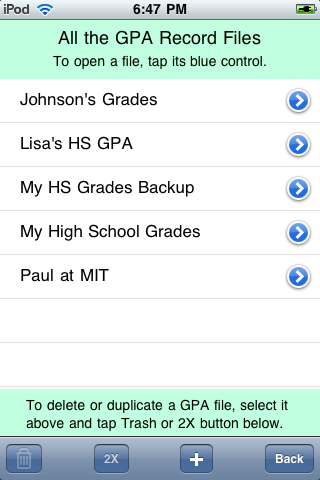
I also decided to make the app capable of keeping the grade records and GPA calculation methods for multiple students. All the GPA files stored on a given iPhone or iPod Touch are available for inspection and modification through selection from a list, as shown below.
files

Finally the app description that was submitted is seen below. Details of how the app works are in the User’s Guide.

OnScreen GPA Pro provides these extra benefits:
• Gives you the power of multiple customized GPA calculation formulas to match any school’s method.
• Lets you keep grade records and calculate GPA for any number of students.
• Makes defining and calculating GPA for what-if scenarios a snap.
• Makes it easy to calculate GPA including or excluding a user-defined course category.
• Allows fractional credits.
• Simplifies entering new data by allowing duplication of existing courses, terms, and whole files.

See the OnScreen GPA Pro User Guide at http://nondummies.com/onscreengpapro.pdf to get a fuller picture of the app’s power and simplicity.

Say you’re a high school student and you’ve set up your GPA calculation to match the way your school does it. That’s what you need for determining class rank. But what if the college you’re applying to turns out to use a different method? Perhaps they don’t consider non-academic courses, such as gym. Perhaps they don’t use a GPA “weighted” to give extra grade points to honors and AP classes. With OnScreen GPA Pro, you just define a new method to match that school’s way and calculate GPA using whichever method you choose. There’s no point being limited to one or two calculation formulas, when this app lets you define one to match that of any school or to make one up to satisfy your own curiosity.

In addition to standard, honors, and AP categories for classes, there is a “wild card” category called “other”, which can be anything you choose it to be. You can define a calculation method to exclude the “other” category. For example, if you’re a college student considering graduate school, you may find that upper-division courses in your major are of greatest importance. OnScreen GPA Pro makes it a snap to calculate your GPA for just those courses. If you’re a high school student, you can peg your non-academic courses as “other” and define a calculation method that excludes them, while having another that includes them.

The app is flexible in another valuable way. You can easily include or exclude from your GPA any given terms or years you choose. In addition to making it easy to see how your GPA has changed from year to year, this gives you the power to make “what if” scenarios for the future. What if you make all A’s your senior year? Just define a best case senior year as one of your terms. Include it in your GPA calculation to see how much it can change where you currently stand. It’s as simple as tapping an on/off switch on your iPhone screen. Use this as a motivational tool.

If you really are a “GPA pro,” i.e., someone whose job involves accessing a lot of GPA, such as a high school guidance counselor or college admissions interviewer, then OnScreen GPA Pro’s ability to keep complete grade records with GPA for any number of students on your iPhone or iPod Touch is obviously a feature you can use. But even if you’re not a pro, you may appreciate the ability to record the grades for all of your children or for friends and siblings. The other benefit of having multiple files is that you can make a backup file, just in case you accidentally delete something from your record.

To make entering new terms and courses faster, OnScreen GPA Pro lets you duplicate ones you’ve already created. It’s faster to duplicate your whole junior year with the name senior year, then go through and edit the course names and grades than to create a new term called senior year and add courses to it one by one. But you can do it either way. Duplicate your whole file to make a backup or to use as a template for making a file for a friend with a similar schedule.

Taken together, the features outlined above put OnScreen GPA Pro in a class by itself.